Brand Design
< DesignBranding across all touchpoints
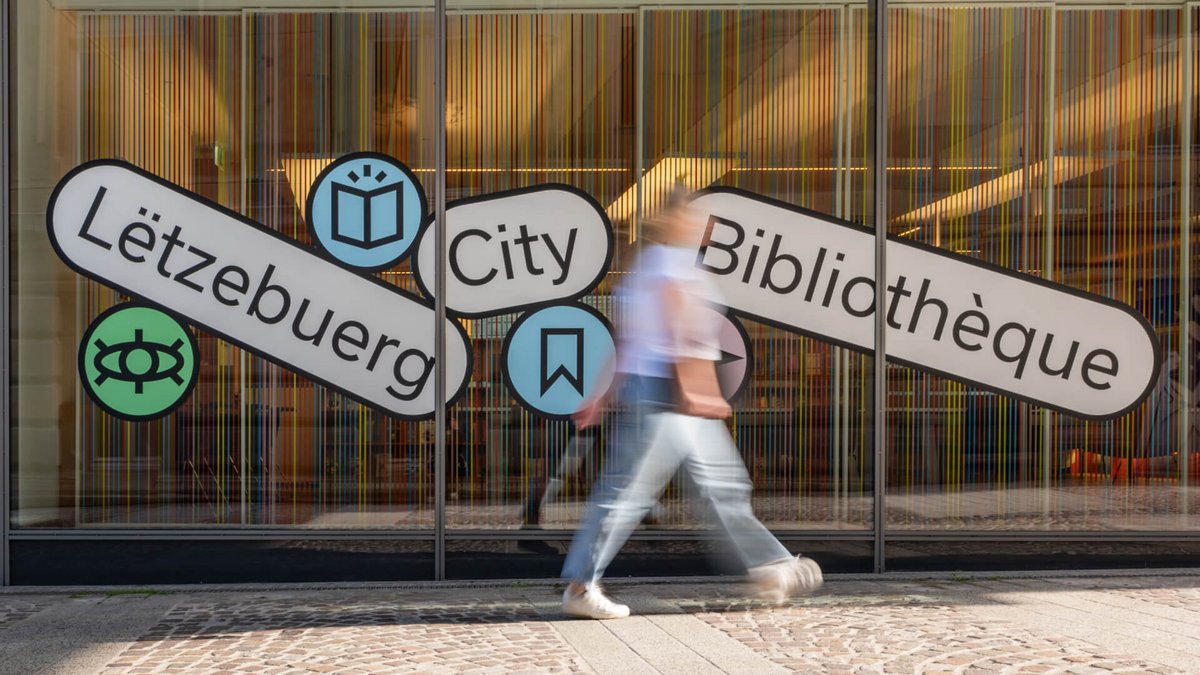
We work with you to develop a brand strategy that gives your brand's message, design elements and visual identity a real uniqueness while remaining consistent across all digital touchpoints. Whether it's your website, social media profiles, marketing materials or internal tools, we build a cohesive and professional brand image.
Branding Solution
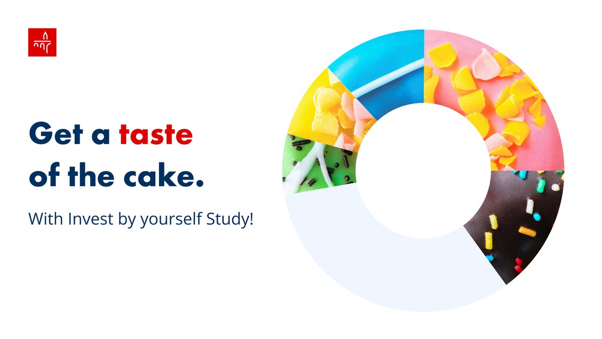
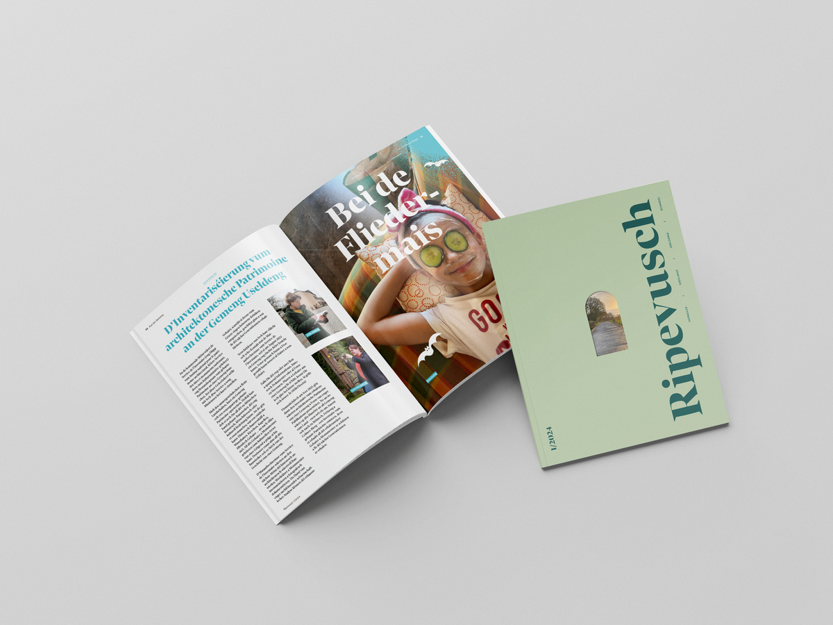
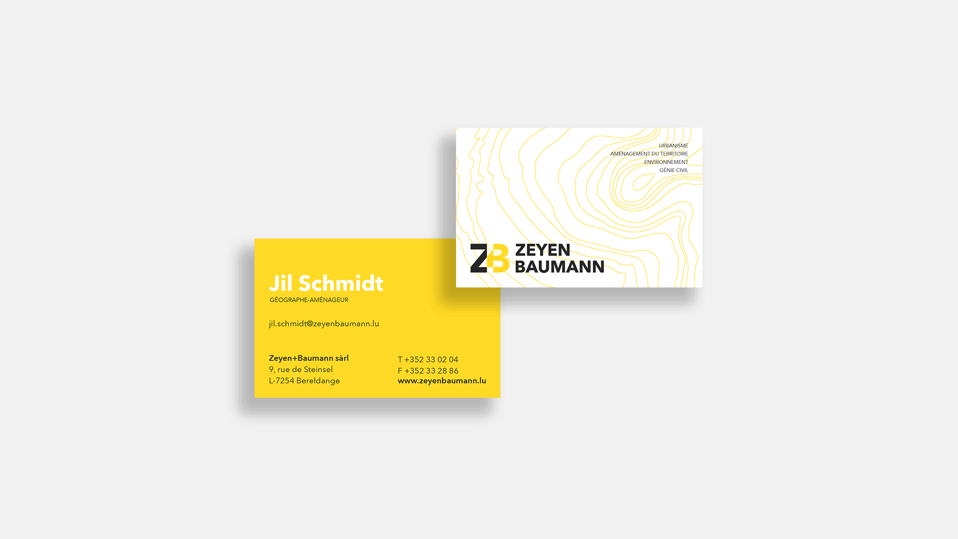
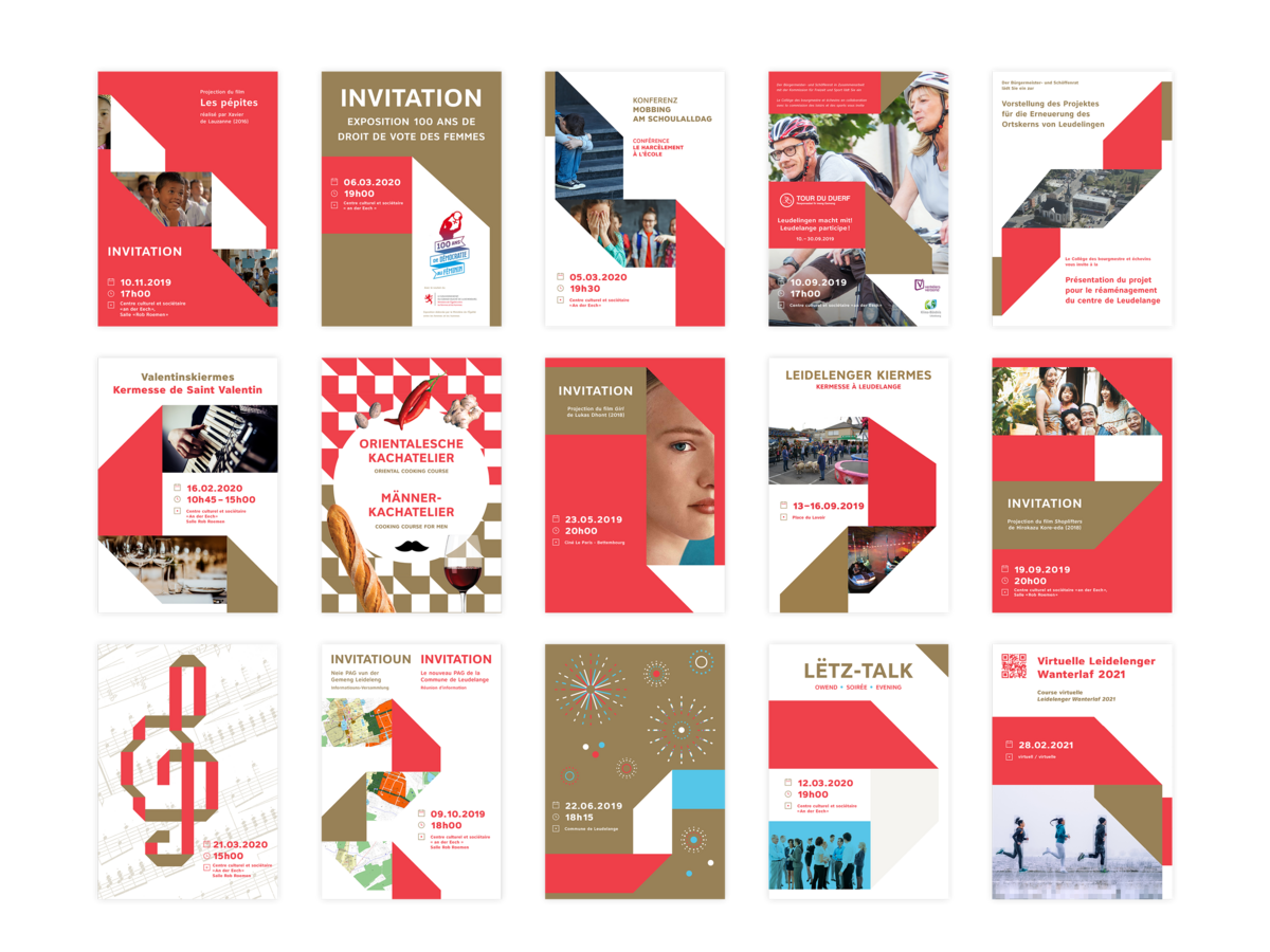
We define with you your brand identity, logo, colours, typography, iconography, illustrations and layout. Whether you need a complete overhaul of your brand or just pieces of digital assets, we'll make it compatible with the rest of your brand.
Guidelines and design system
We provide a practical design system via an internal website that all employees can access to download and use the various resources. This is a very effective strategy for storing and sharing all the elements of a new graphic design and new design rules. Rather than relying on a (sometimes) outdated PDF document to visualise and explain these elements, this strategy provides an up-to-date and easily accessible platform for organising and communicating design guidelines.
Your team and partners can always access the latest design information, templates and resources, helping you in keeping your digital presence cohesive and the quality of your branding and promotional materials high.