Villa Vauban · A lively and modern brand identity for Villa Vauban
The Villa Vauban is a historic institution and encapsulates tradition and modernity in the heart of Luxembourg city. For their brand identity, they asked us to embody their values and tradition, while preserving the historic element and importance of their institution.
Challenge
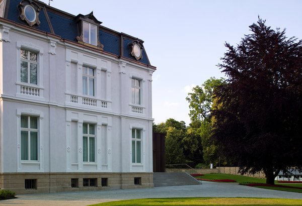
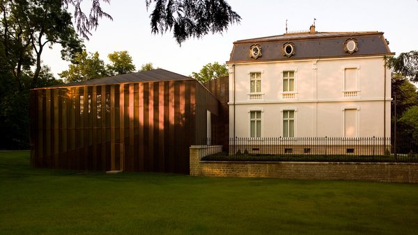
For cultural institutions, a visual identity needs to be more than just a representation of the brand. It should convey meaning and awaken curiosity. The Villa Vauban was built in 1873 and modernised in the 21st century with copper cladding, but what never changed were the triangular dynamics of the building and its exhibitions.
The Concept
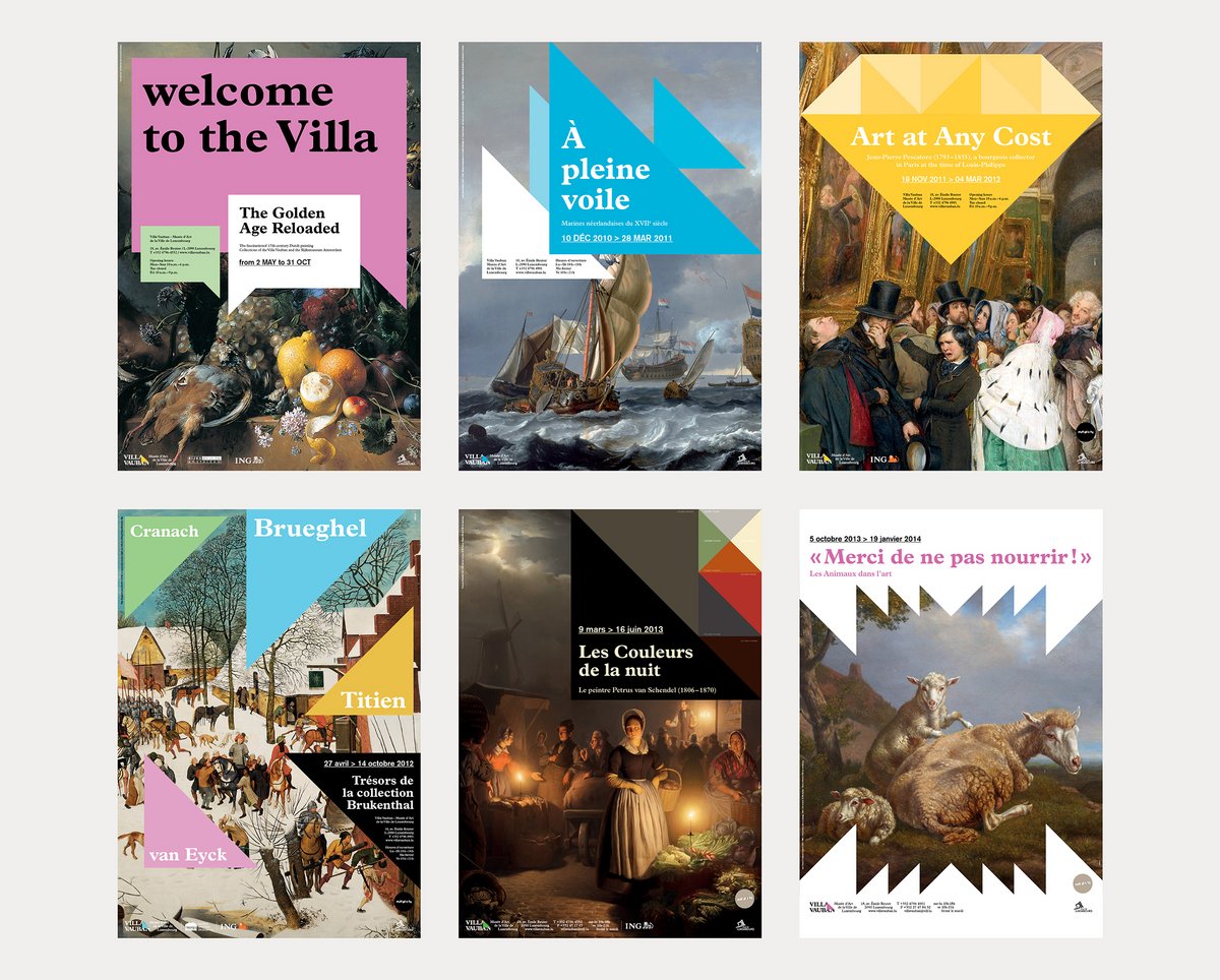
There are few things as dynamic as a triangle. From Villa Vauban’s characteristic architecture to the acute or obtuse angles of its body, all the way to its roof, the triangle is omnipresent.
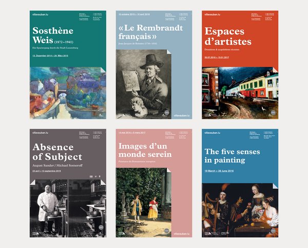
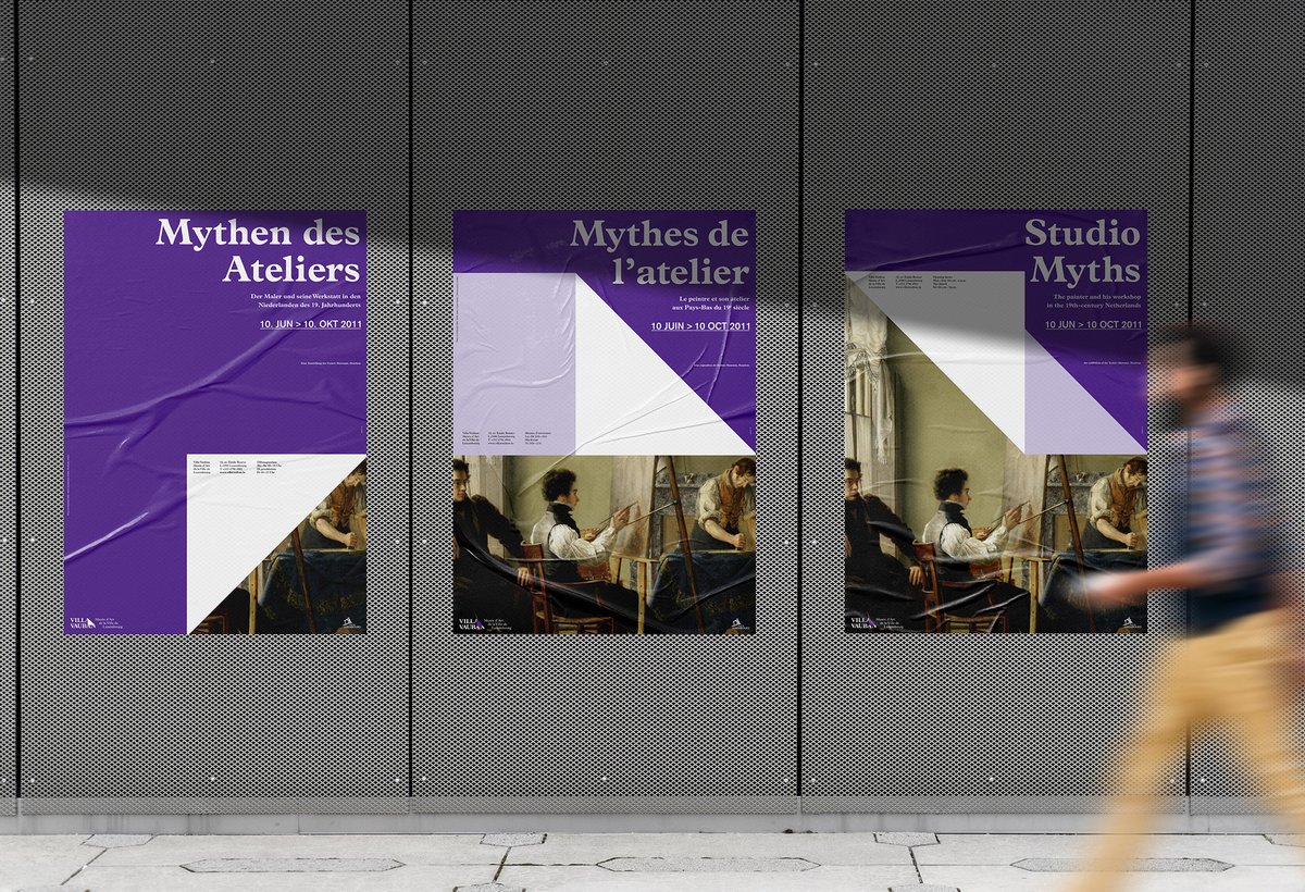
The font of choice is Plantin, a renaissance typeface celebrating sixteenth century book typography with mechanised typesettings in mind. Just like the Villa Vauban, this type merges tradition with modernity, making it the perfect fit.
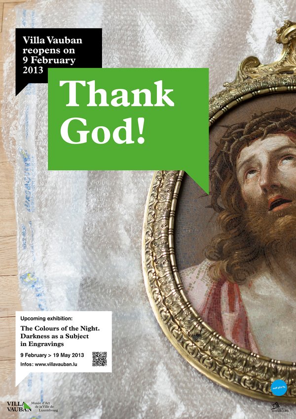
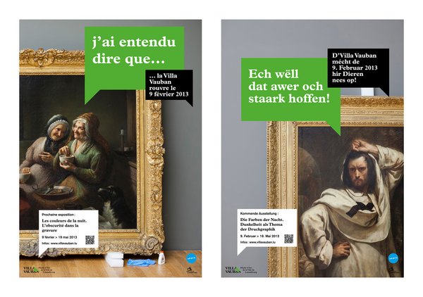
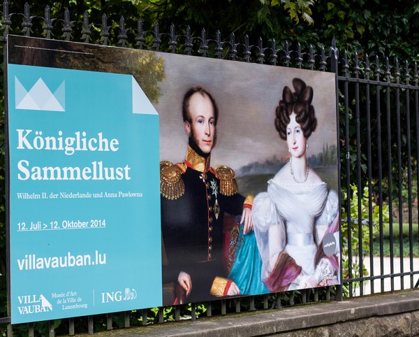
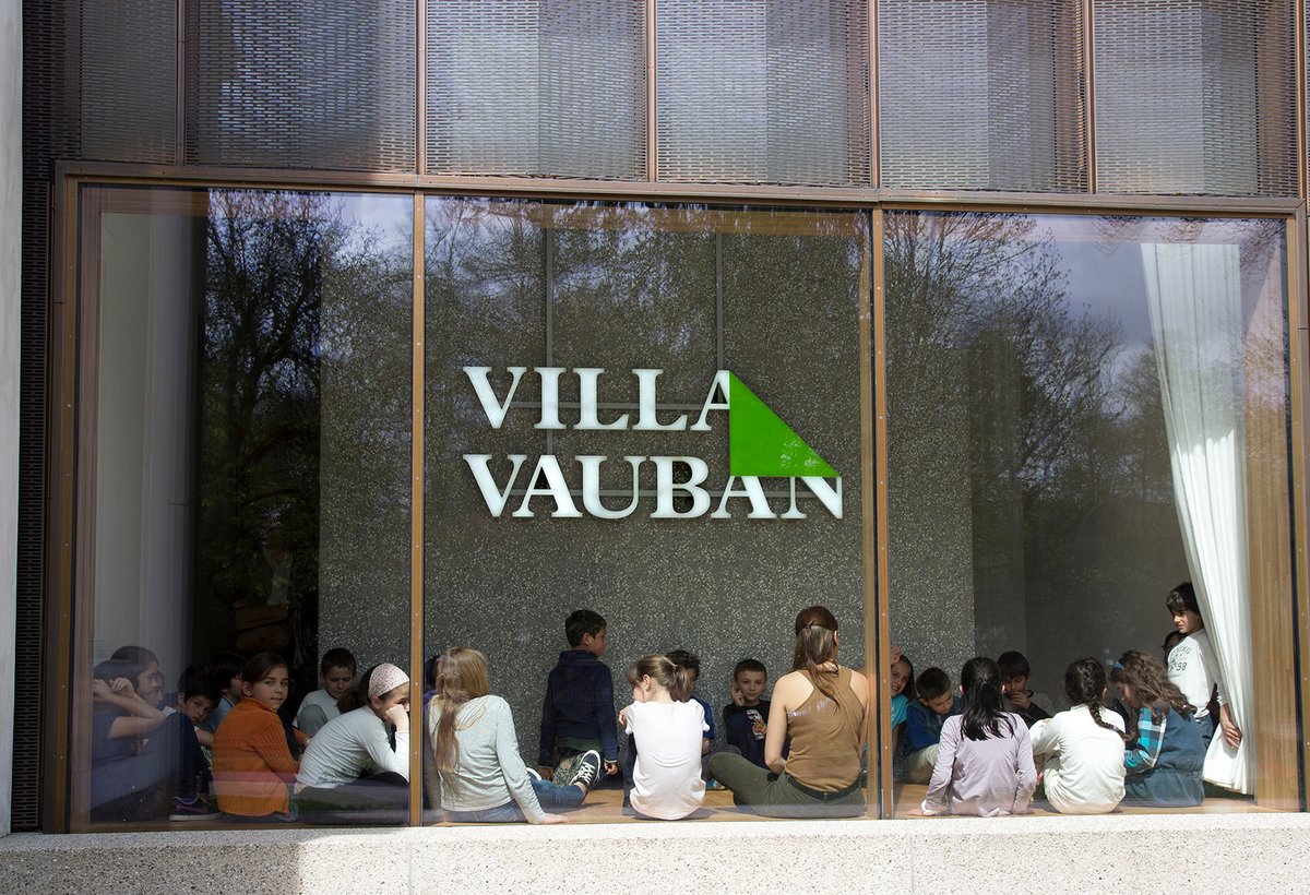
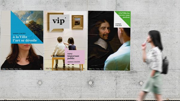
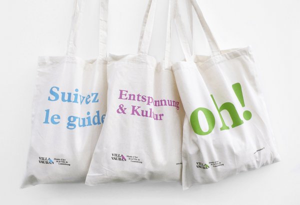
The triangle is nothing more than a folded corner in the logo. It indicated that, behind each element is something hidden, a meaning, a story, the life of an artist… A context you can discover at the Villa Vauban.
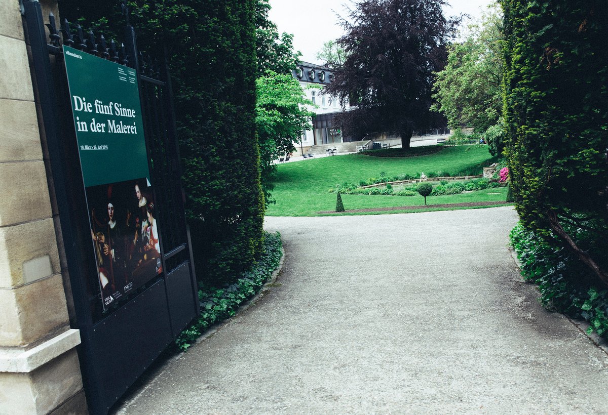
Why green? Well, if you visit the Villa Vauban, you’ll see that it is surrounded by the town’s greenery.
