Fiveoffices · Branding, Design and Frontend development for Fiveoffices
Brief
Fiveoffices aims to put an end to empty office spaces and have a sustainable impact by connecting office landlords and tenants for mid to long-term leasing contracts. Fiveoffices has decided to trust our holistic expertise in Branding, Web Design, and Frontend Development to carry out this ambitious mission.
Challenge
This project raised four main challenges:
- First, come up with a name for the brand that makes sense and is available.
- Second, find a logo symbol that represents the concept of the service and avoid being too cliché or looking like a copycat.
- Third, design a brand identity that is bold (strong brand), disruptive (can be different), 100% straightforward (simple), and entirely logic & natural (destined to become a leader).
- Fourth, design a feature-heavy user experience to meet today’s high standards in the industry.
Solution
Name
We came up with the name Fiveoffices for three reasons:
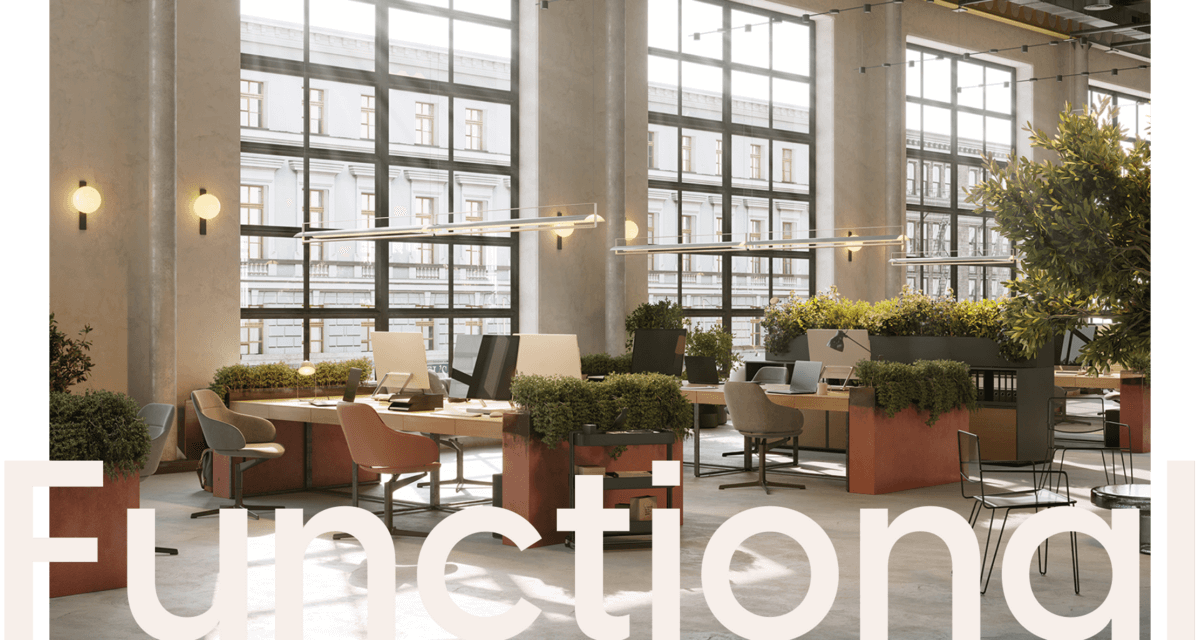
- Based on research from the client, people typically describe their offices using five main styles: contemporary, functional, authentic, bright, and central.
- There are five reasons why hosts and guests will get an enormous benefit out of the platform: It’s flexible, it’s sustainable, it’s cost-efficient (generates pure EBITDA), it’s easy to use, and it’s transparent (connecting hosts and guests).
- And coincidentally, there are also five steps to how the platform works.
Logo
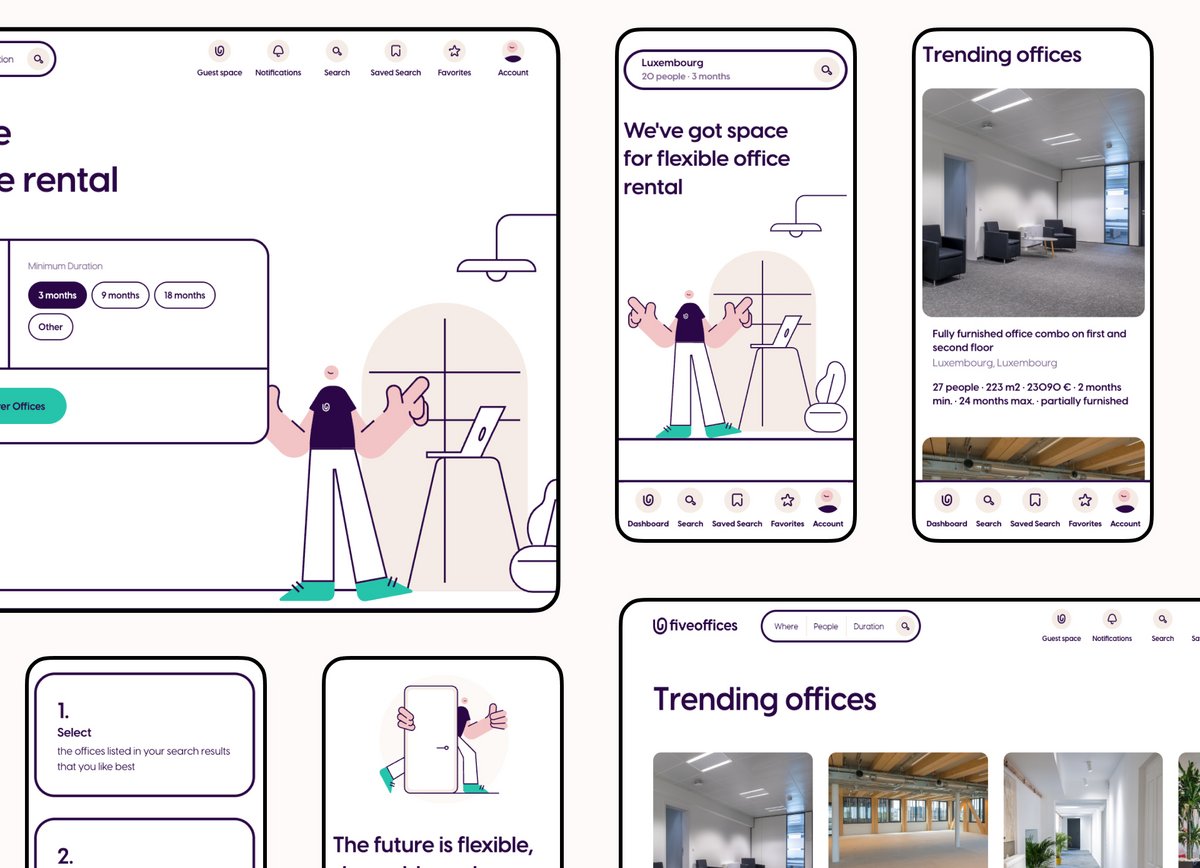
After a few unsuccessful iterations of playing with the number 5 and the symbol of a building, we quickly came up with a very different concept: the paper clip. The paper clip is a basic object that can be found in almost every office and whose main purpose is to group sheets of paper together, like the sheets of a contract. The paper clip looked like the perfect object to represent an office environment as well as the idea to create leasing relationships between landlords and tenants.
Brand Identity
In regards of the colours, we went for an original colour combination of a Deep Violet and a slight Beige to get a professional and modern look & feel. We completed the colour palette with a Turquoise action colour to bring a disruptive and bold touch.
The Brand Identity was then expanded with:
- A set of custom icons to illustrate navigation items or describe office characteristics like office amenities and services.
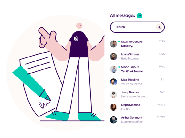
- A set of delightful and meaningful custom illustrations to support more complex concepts and help visitors connect with the brand at different levels of awareness.
User Experience
Very high standards are already established in the market of two-sided services, with companies like Airbnb, Blablacar, or Uber to mention just a few, that users are getting used to a best-in-class experience. To get as close as possible to these high standards we identified the key success factors of the core platform features and put extra focus on them:
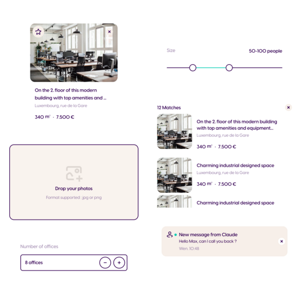
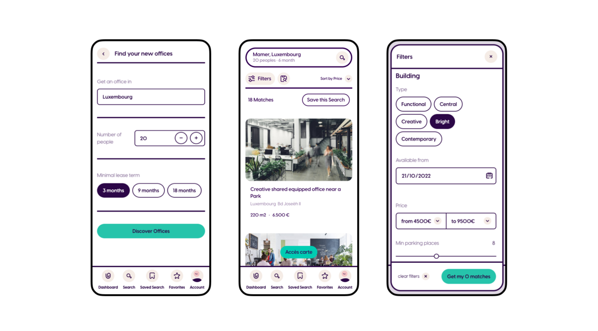
First of all, a practical search experience that provides extended filtering options, easy office localization, and attractive office previews.
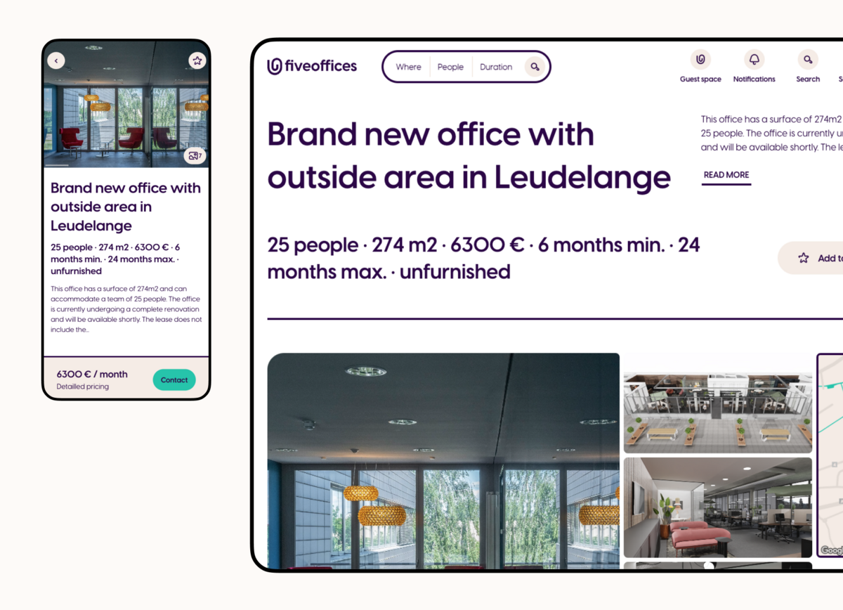
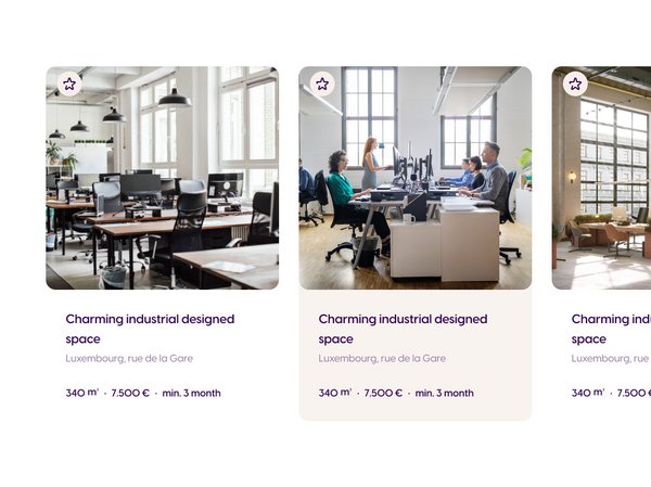
A standardized office record that embellishes any property and makes finding/comparing information very easy.
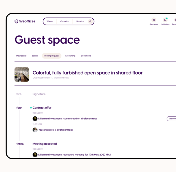
And finally, an intuitive management system for both Guests and Hosts that allow any user to easily manage communication, requests, contracts & documents, properties, accountings, and preferences.