Frontend Development
< DevelopmentCustomized Bootstrap Framework
For the front end of the project, we recommend using the Bootstrap framework, which we'll fully customise for your project, and we'll provide you with a style guide and an online component library. Our approach goes beyond creating templates. We build around Bootstrap and your brand identity, creating a style guide and component library that are also easy to use.
Performance and Accessibility Optimization
Performance and accessibility are one of our top priorities. We integrate optimisation techniques into our workflows. As far as possible, we respect best practices such as lazy loading, the use of WEBP format with fallback options, and the automatic size reduction of assets (HTML, CSS, JS, and media). These optimisations ensure that your website looks good while loading quickly.
Mobile-First Responsive Design
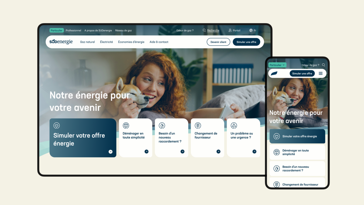
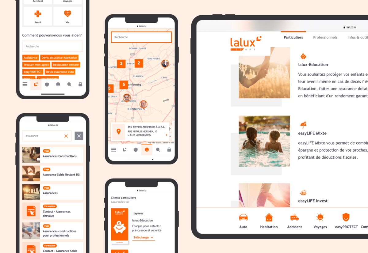
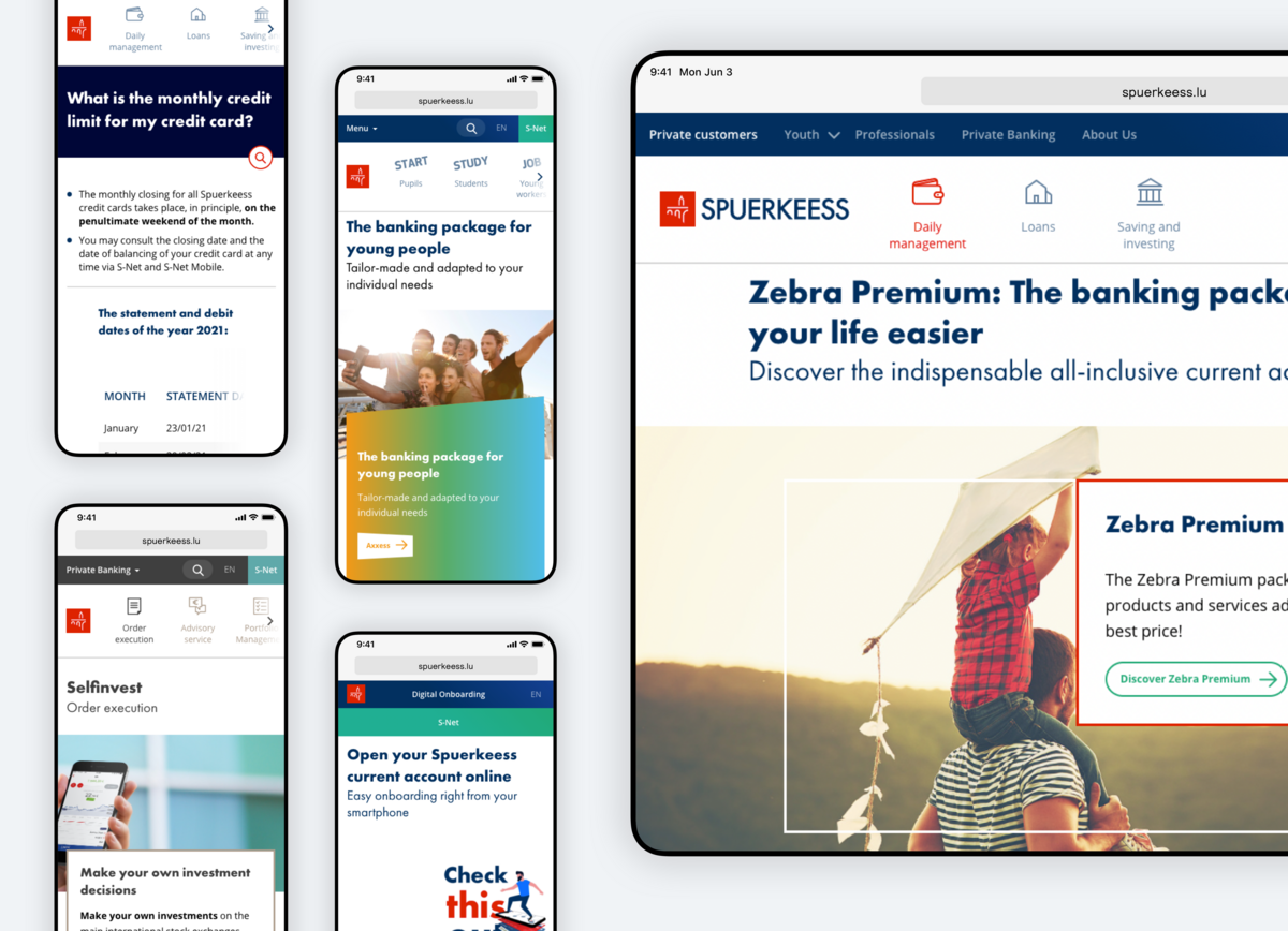
Responsiveness is now an obvious and overriding consideration when it comes to front-end development. But we really emphasise on adaptation to all screen sizes and stay very close to industry updates. Our component library development incorporates the concept of 'responsive' with a fully integrated 'mobile-first' approach. This means that your users, whether they're on mobile devices or desktops, get the same experience on the website. Our sites automatically adapt their layout to provide a consistent and intuitive experience, whatever the screen size.

