LALUX Assurances · Full Design and Technical revamp of LALUX Espace Client

Brief
After a revamp of the Marketing Website and the Mobile App, it was time for LALUX’s Online Client Area, on Desktop and Mobile, to undergo a complete update.. As leader in the insurance industry, LALUX needed to complete the loop and update the last block of its experience: perfect the area where clients can manage their contracts, check their reimbursements or even get assistance.
Challenge
This project raised three main challenges:
- First, keep the user experience consistent between the Mobile App and the Desktop Web App.
- Second, set up viable technical foundations for the future of LALUX’s application ecosystem.
- Third, create a shared code-base for all platforms with a different renderer per platform.
Solution
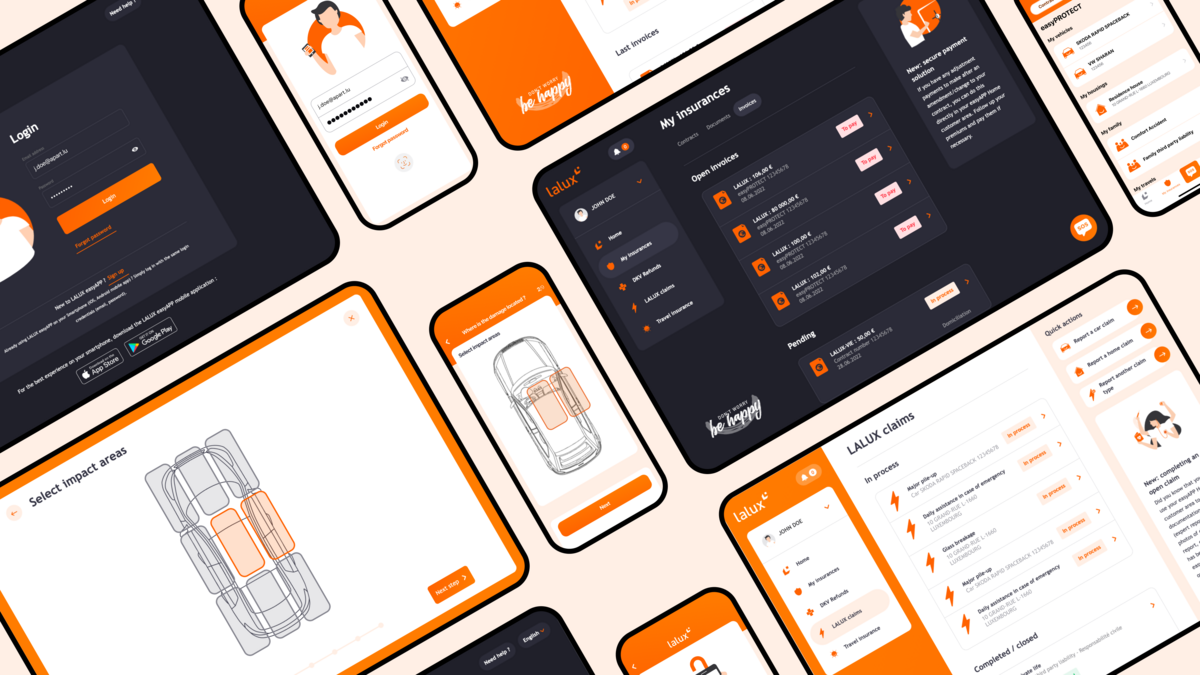
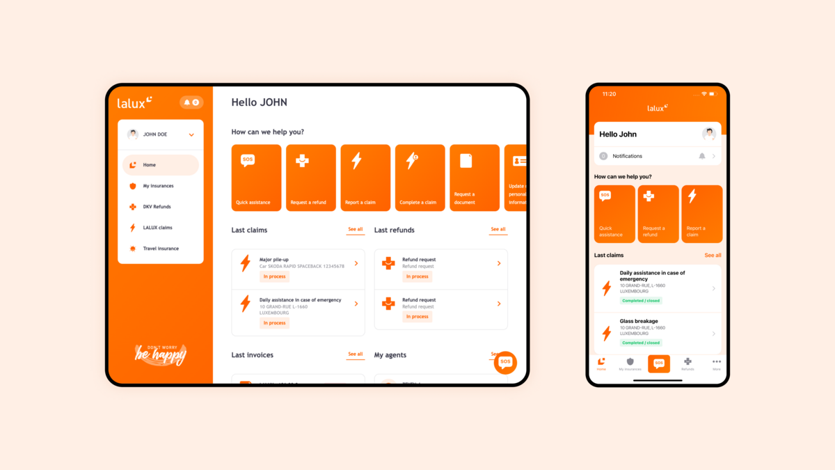
A Unified Experience
Since this project was about developing LALUX’s Client Area, it was crucial to adopt a user-centric approach where the user experience between the multiple platforms was consistent. To achieve this consistency, we had to create a shared code-base that would be implemented across all platforms allowing us, where possible, to reuse components while reducing the time needed to integrate new features.
The result we were aiming for: a unified customer experience containing exactly the same features and functionalities on all of LALUX’s different platforms. Clients should be able fill out declaration forms and pay their bills whether they are in the app or on the web.
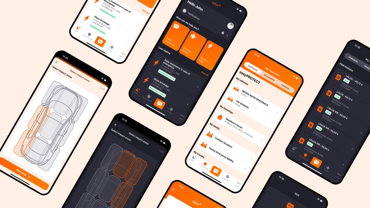
Despite both platforms being visually almost identical, there are a few additional functions which are unique to each platform, in particular the navigation which was adapted and put in the most-commonly used place of each platform so that users would be able to find their way around more easily, while others were specifically designed for the mobile environment. We implemented push notifications, which can be used to send time-sensitive content to clients, and biometric identification (e.g. facial recognition, touch id). The app is also available in dark mode and fully compatible with analytics tools as tracking events have been put in place.
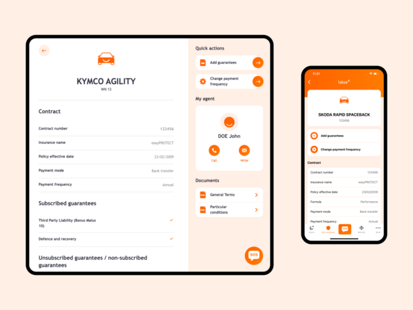
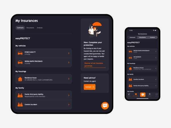
On Desktop, we took advantage of the free space to display information that is usually one click away on the Mobile App.
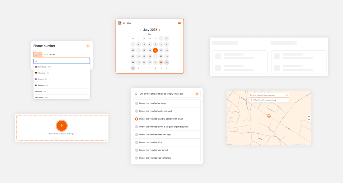
Attention has also been paid to the finer details of the user experience. For example, the Phone input that facilitates the selection of a country extension, the loading state of some part of the interface that mimics the skeleton of the content, or the way a user can upload an image but also how the search behaves when browsing large lists of options.
Applications ecosystem
For several reasons, we suggested building LALUX’s online client area with Meta’s React Framework and its mobile variant, React-native.
With React, we had a mature toolset that supports a large number of platforms and allows us to compile the same code into different environments, as well as on different operating systems (iOS and Android). This would later on allow us to easier apply requested changes and implement new features, such as form creations, components behaviours, to all of the platforms.
From a developer’s point of view, React offers a great experience as it takes on a modular and intuitive approach to develop and use components across different applications.
Also, React is part of a broader ecosystem where the web and mobile application worlds can meet and share pieces of code. As part of the same platform, both LALUX’s Mobile and Desktop apps benefited from being managed as a single project.
In this context, embracing React cuts the cost of future developments for both applications and makes LALUX’s applications ecosystem maintenance easier; All of that without any downside in terms of performance and experience for the end-user.