Spuerkeess · Corporate Website Redesign
Brief
Spuerkeess, one of our long-term clients with whom we have collaborated on several large-scale projects in the past, recently updated their corporate identity and were looking for help in transferring this identity to their corporate website. The end result should be a clear and coherent design that follows the visual guidelines of their new Corporate Identity. Discover in this case study how we came up with a fresh look for Spuerkeess.lu with the help of a fully-functional Design System.
Challenges
Eight years after the first redesign of Spuerkeess.lu, one of the biggest challenges was the fact of having to question our own previous work and having to find new ways and ideas to improve it.
Without taking this into account, the specific project challenges were aligning the visual identity of each one of the different Spuerkeess platforms and also making them clearer and easier to use in order to improve overall accessibility.
Solution
The goal of the redesign was not to revolutionise the previous website identity, it was more about fine-tuning and elevating the graphic elements that were already in place and creating a technical coherence within the Spuerkeess universe.
To achieve this and facilitate the transition, we created a design system, a set of design and programming guidelines that applies to each design component. This practice is used to efficiently unify large-scale client projects such as the redesign of the Spuerkeess website.
A design system is made up of design tokens. Design tokens can be described as a shared language between designers and developers that is used to describe component properties that make up a design system’s visual aspect. A token’s value can represent several things, e.g. a colour, a measurement or a typography.


The main advantage of using design tokens is that they create links between the design features of different channels and guarantee lasting consistency if used properly. If a token’s value is changed in one place, the same changes will apply to each component made up of this same token.
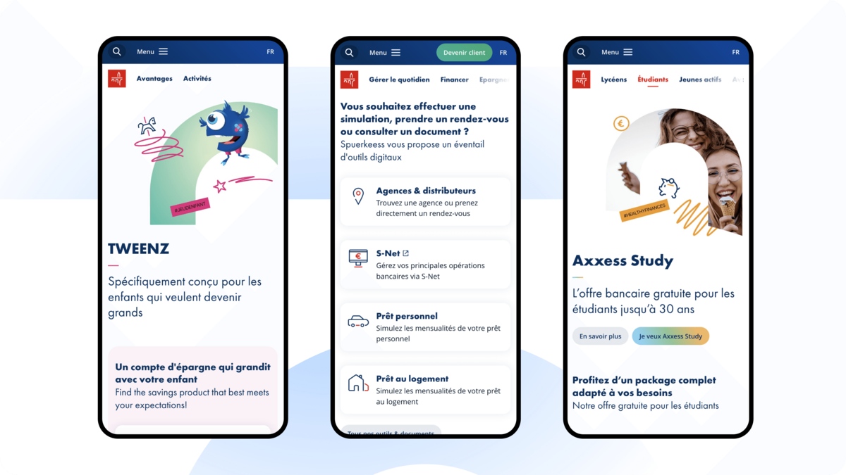
Having a strong set of design tokens in place helped us with the design synchronisations on the different Spuerkeess platforms and will allow us to carry-out quick system-wide updates if new visual changes are required in the future. Thanks to this implementation, we easily managed to integrate the same type of illustrations and iconography as well as the same product definitions that Spuerkeess users already knew from S-net.

New Design Features
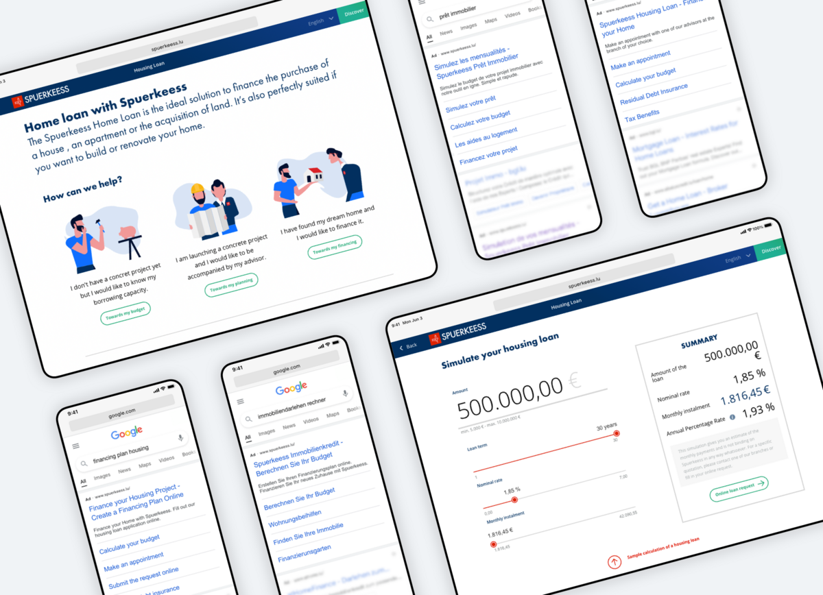
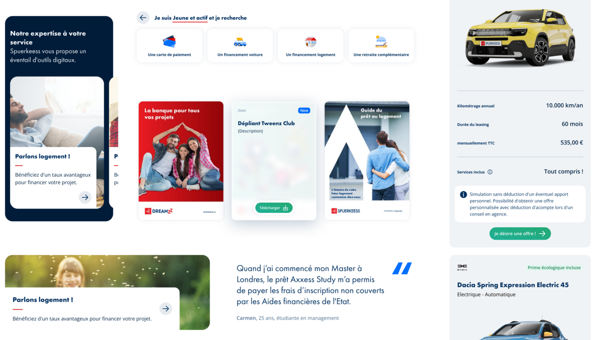
We didn’t just synchronise existing design features, we also added new corporate elements and simplified others to prioritise the user experience and make the navigation more accessible.
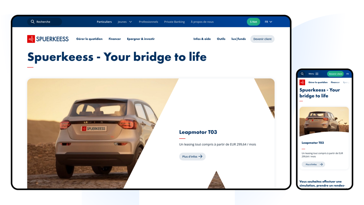
One of the bigger visual changes of this redesign is the use of the logo to add a dynamic look and feel to the website’s header images. We used parts of the Spuerkeess logo and applied them to the photos already available on the website to create a visual impact.
Conclusion
By taking advantage of existing elements, based on a strong design system foundation, and adding only small design adjustments, we managed to deliver a successful website redesign which represents Spuerkeess’ CI better, has a modern look and feel and is easier to navigate.