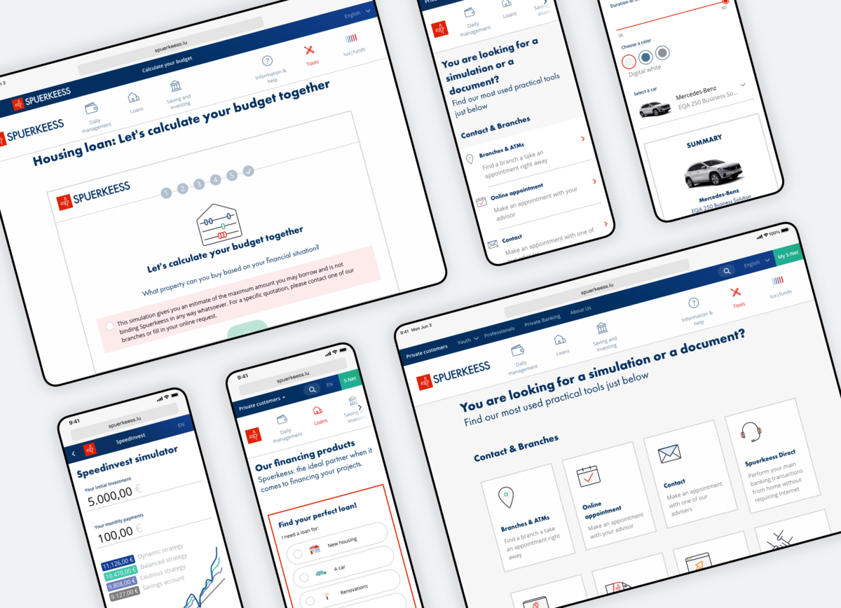
Spuerkeess · Design and development of a full responsive website for Spuerkeess
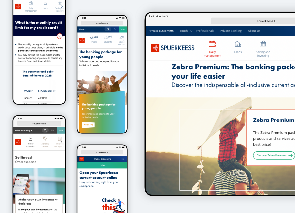
For every big player there comes a time where its digital appearance feels too old-fashioned or even outdated. In 2015, Spuerkeess asked us to revamp their website to break out of the old and take the path towards a new digital era with a modern user experience.
Challenge
Back when the first Spuerkeess website was built, the web was not as mobile and advanced as it is today. In 2015, banks on the market were slowly shifting over to responsive websites. In consequence, Spuerkeess had to adapt and embrace this inevitable switch. But to differentiate Spuerkeess from the competition, we decided to put extra consideration into User Experience.
From our client’s brief interpretation we drew 4 main objectives:
- Modernise Spuerkeess’ digital visual identity
- Focus the navigation on the user intent rather than on the organisational structure
- Guide the user during the key momentum of his website exploration
- Enhance the user journey with contextual helpers
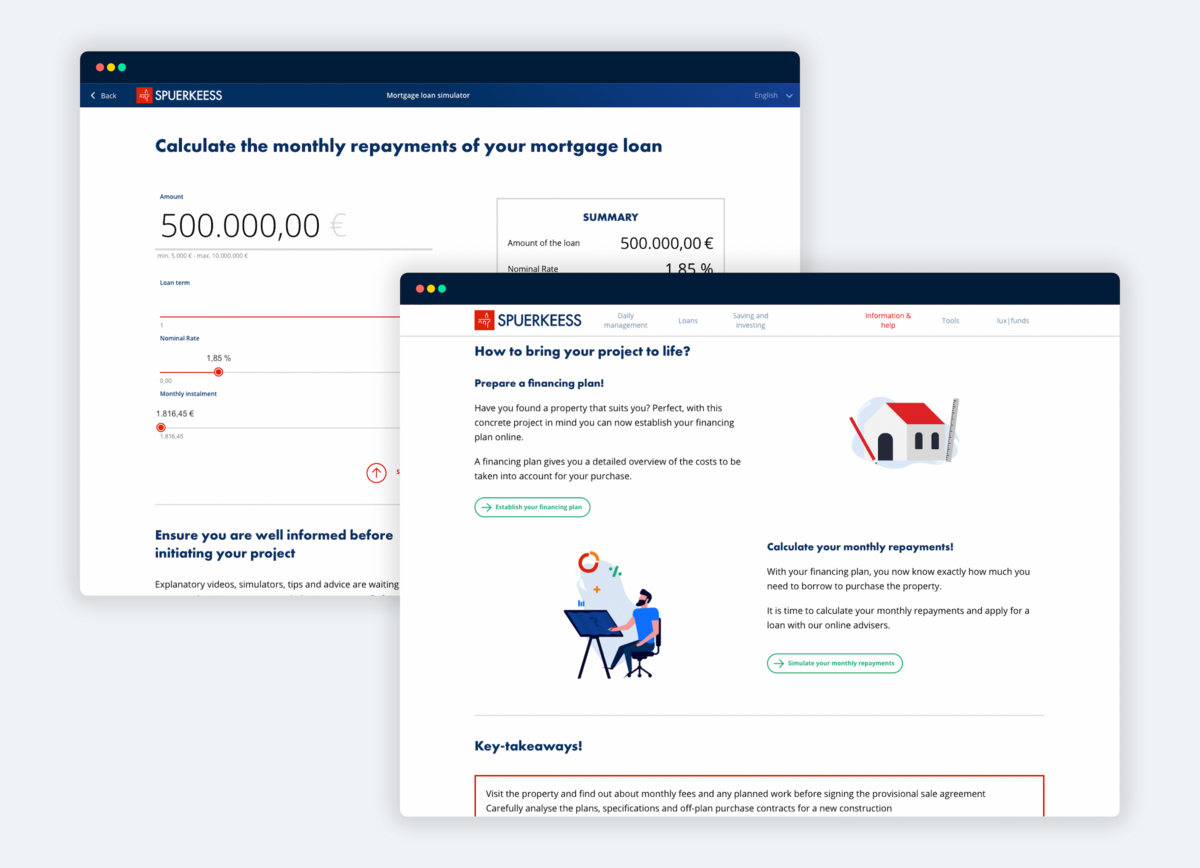
Solution
Main navigation
The main navigation is structured around 3 obvious consumer intents. No menus or drop-downs involved, the user lands on dedicated products listing pages. A decision helper aids to refine the search and needs. This concept of contextual “on-page guidance” is used in different ways throughout the pages to strengthen the website’s ease of use.
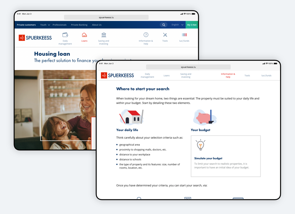
1. Navigation helpers
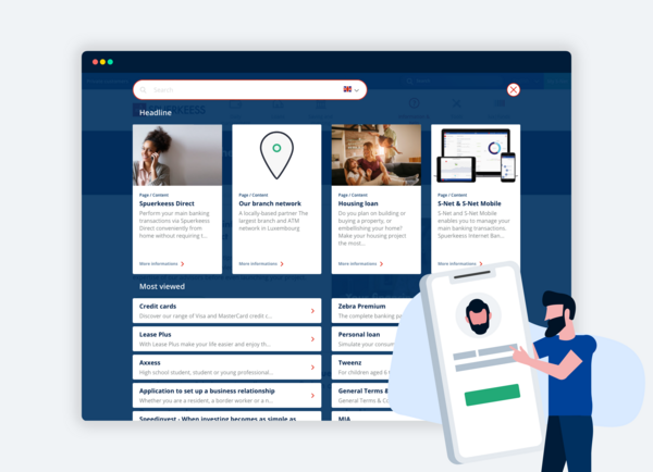
Regardless of our experience of the web or a specific website, it might happen that we don't succeed in finding what we're looking for. To avoid those frustrating situations we developed navigation helpers, providing a new approach to locate the user's requests. You can refine your need through a number of options and get redirected to a relevant page. From blog posts to frequently asked questions or guides, the user has access to all the necessary information he would need to go into more depth.
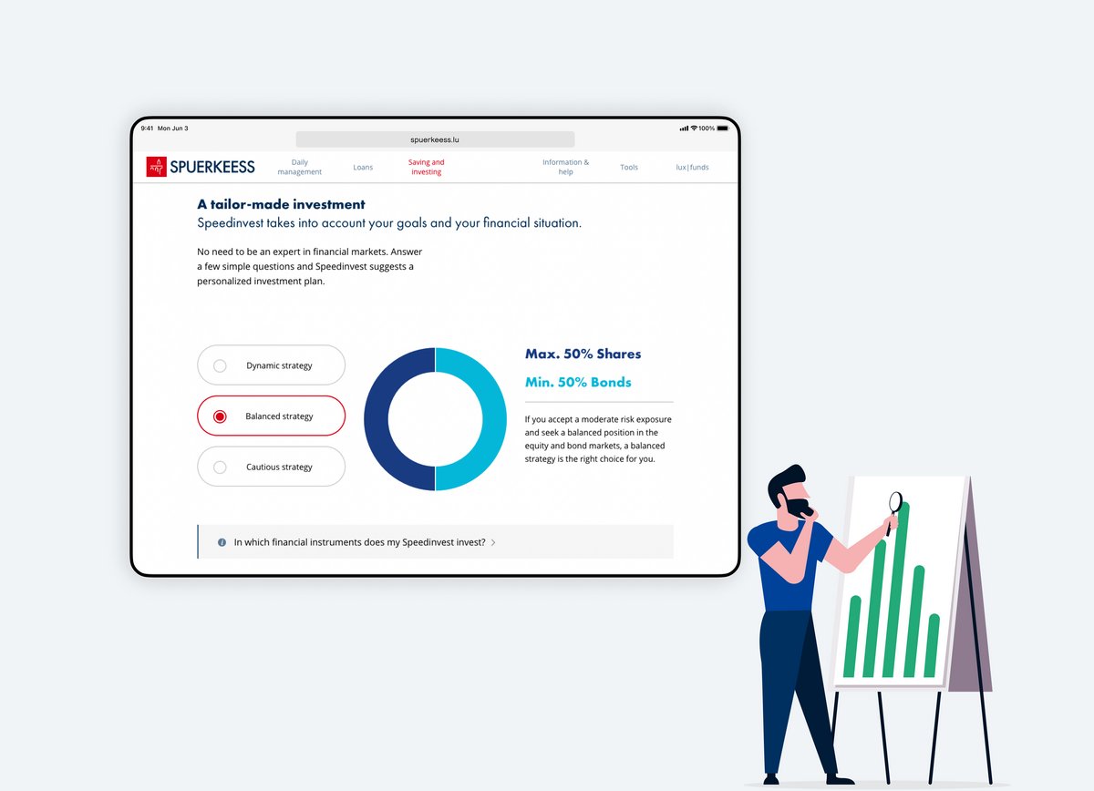
2. Decision helpers
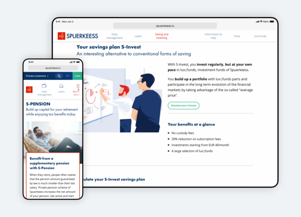
An exhaustive list of products and services is good but a relevant selection is even more useful. Decision helpers offer the users a way to filter according to their needs. Fewer choices equal less friction, the result is a nicer browsing experience.
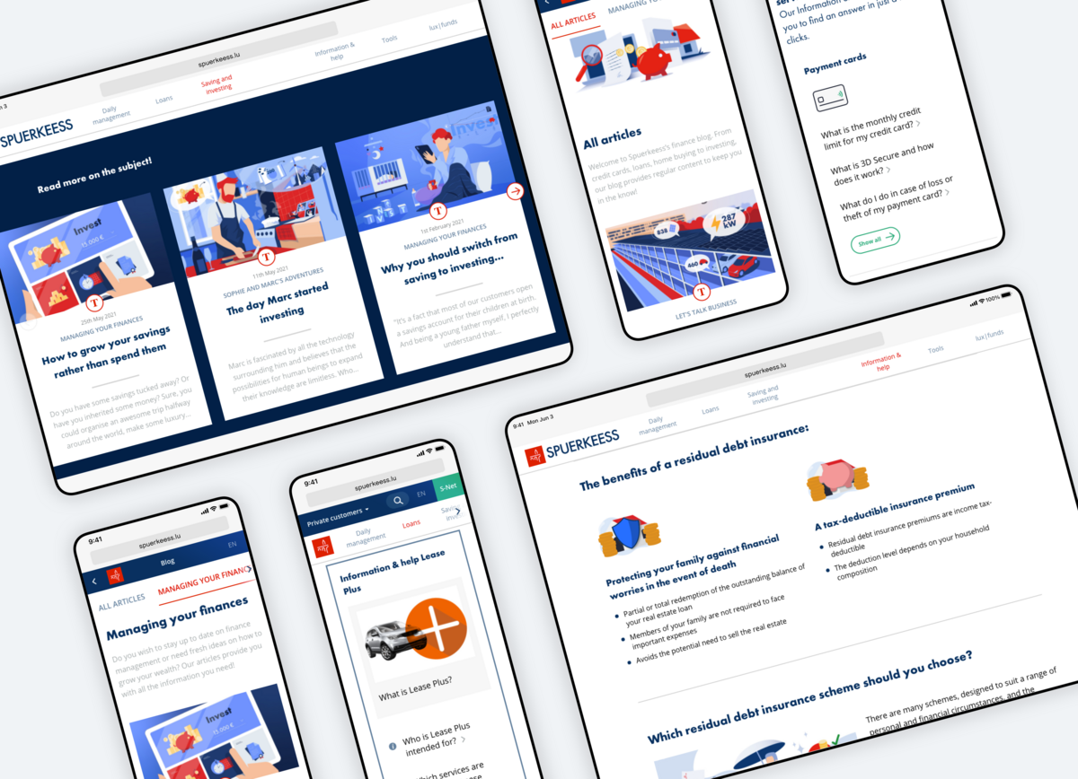
3. Contextual contents
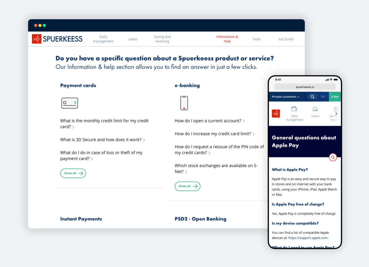
How? Where? Why? … We always have many questions but we hardly get answers. With the intent to provide as much information as possible, we did marketing workshops with Spuerkeess to teach them how to develop a Content Strategy to achieve this mission. The marketing team is now able to disseminate content contextually depending on the page’s objective and purpose for ubiquitous access.
“Today, Spuerkeess.lu is much more than a website, it’s a full digital eco-system. It has become the backbone of our content marketing and digital advertising efforts. APIs and SDKs are shared with our partners and dedicated landing pages can be built on a daily basis without the need of new developments. The flexibility of the infrastructure as well as the reactivity and creativity of Apart have been a real game changer for our digital marketing efforts.”
Luc Sinner, Deputy Head of Business Unit Marketing
