Powersave · Branding, User Experience and Marketing campaign
Brief
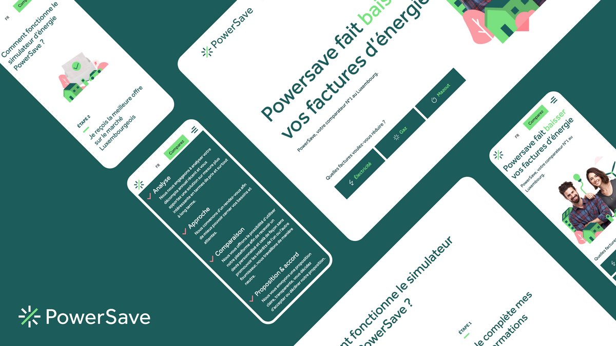
Powersave reached out to us with the intention to launch Luxembourg’s first energy broker service. We took charge of designing their visual identity and digital branding.
Challenge
As it’s the first of its kind in Luxembourg, the main challenge was clear. We needed to explain and sell a completely new service to a large target audience.
On top of that, the design for Powersave’s website had to present and offer a simple and straightforward user experience: obtaining a discounted offer with a few clicks.
Solution
Logo
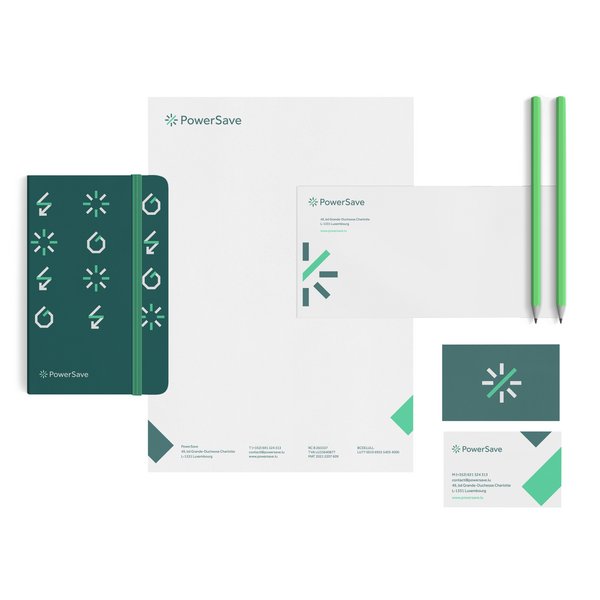
We designed Powersave’s logo to look like clock hands to represent its commercial concept. Like a compass needle, Powersave guides its clients towards the best option. The logo is also reminiscent of various other elements that are typical in the world of energy, economy and technology.
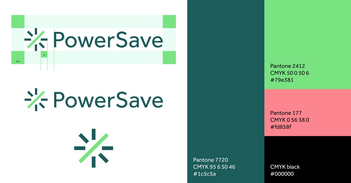
For example, mechanical elements such as a measuring tool, a gas burner or the compass can be found in the logo design. It also reminds of the sun, a natural element, or the percentage symbol with the diagonal line in the middle, a mathematical reference.
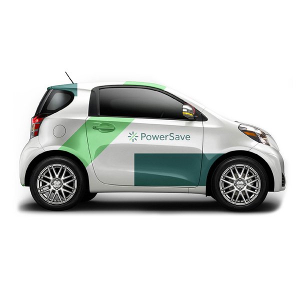
Branding
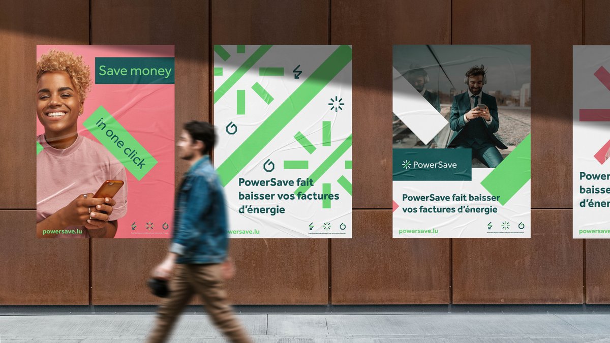
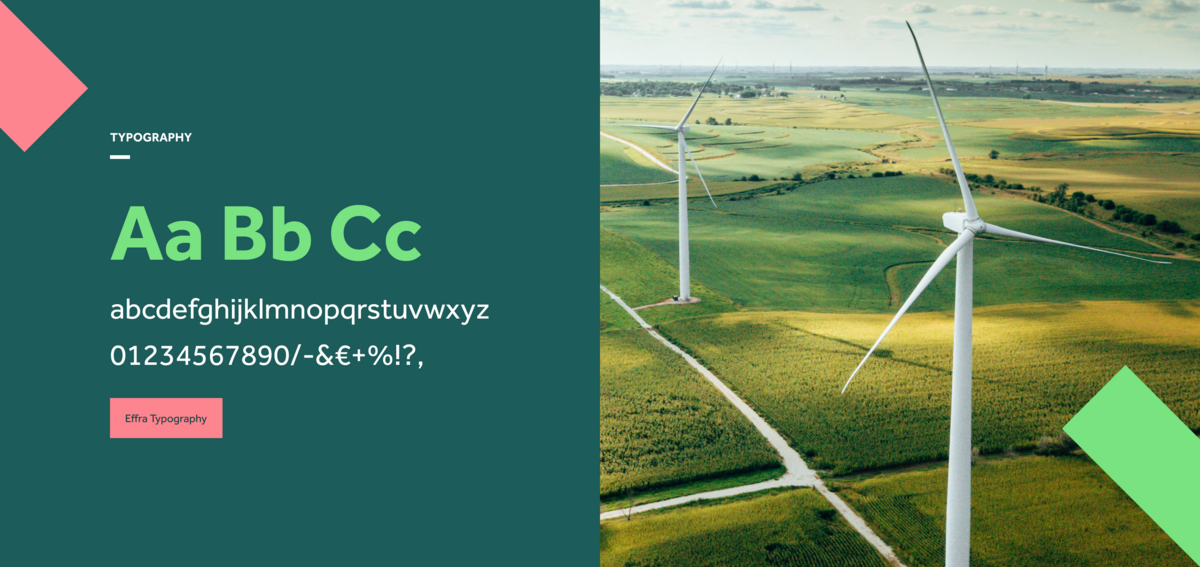
The visual identity balances vivid colors with a human touch. Illustrations are combined with real people and objects - topped off and held together by Jonas Schudel’s Effra font.
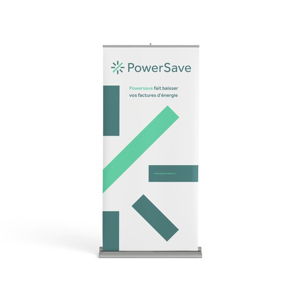
The slogan used on the website could not be clearer: “Powersave lowers your energy bills”. For the campaigns, we angled it in an even more direct way that captures attention quickly: “Energy at the best price!”. This message creates curiosity and invites the page visitors to explore more of the comparator service.
Website
The first step of building the website was obviously to create the simulation tool. To do that, we collected the information of different energy providers in Luxembourg to calculate the ideal simulation for each individual user.
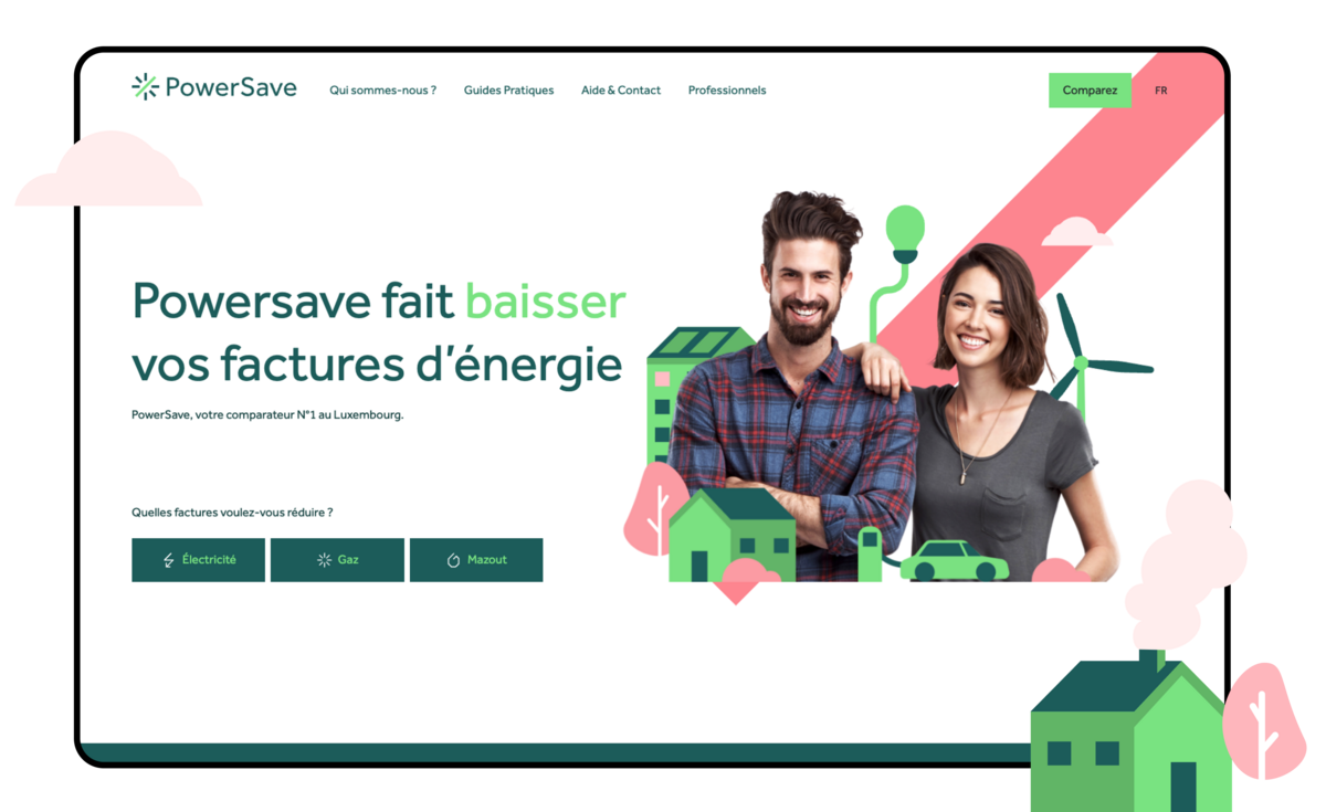
After the simulation tool was validated, we designed a clear-cut user experience by removing all the information that wasn’t necessary for the engine’s calculation. We also replaced the free text field in the form with an option choice alternative.
In a matter of seconds, the user receives tangible numbers that show how Powersave is useful to find the best energy prices.
This makes the service easy to understand and quick to use at the same time - exactly what Powersave were looking to go for.
