A corporate identity tied to the Luxembourgish mining tradition
OpderSchmelz · Corporate identity for opderschmelz
Opened in December 2007, the cultural centre presents all kinds of exclusive events for a varied public.
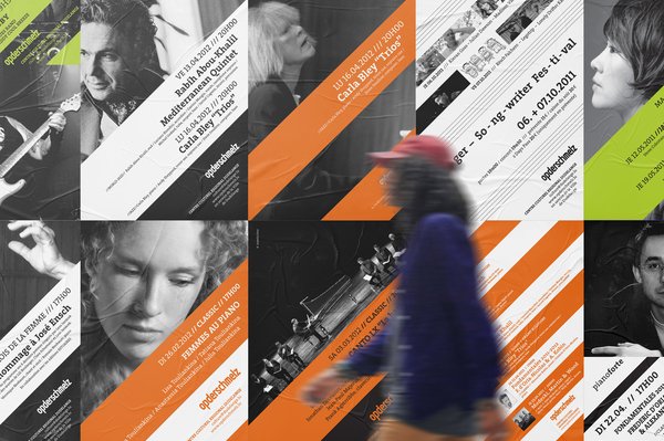
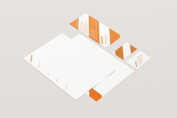
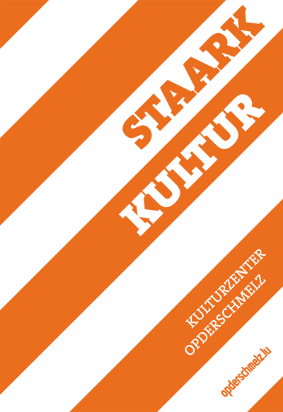
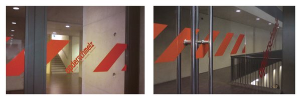
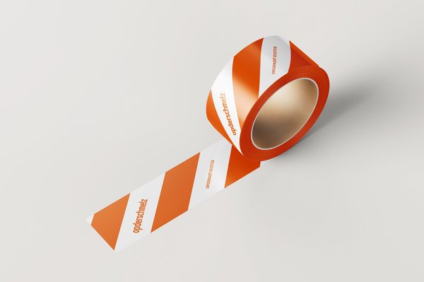
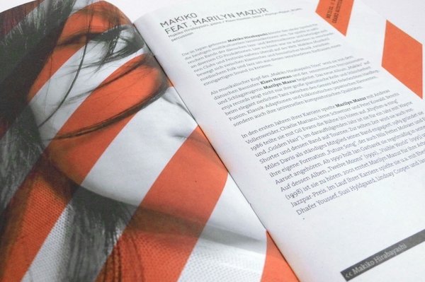
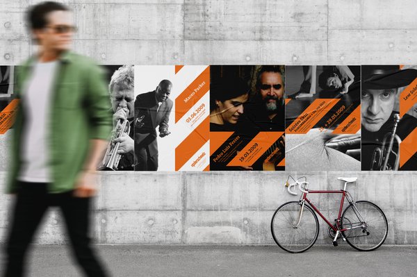
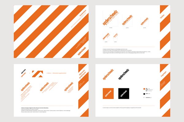
The corporate identity is based on the “Work in progress” –diagonal red and white stripes. The signposting is direct and efficient and ties in with the mining tradition of the site. It makes for simple and efficient communication - “attention: culture” – but also a more subtle message concerning cultural “work”. A slightly transformed Isonorm typography is used for the logo and titles and TheSerif for the running text.

Client
OpderSchmelz
· Le Centre Culturel Régional opderschmelz affiche depuis 2007, l’année de sa création, une programmation pluridisciplinaire et variée.
Services
Link
Grab another snack