Commune de Leudelange · Brand identity for the primary school in Leudelange
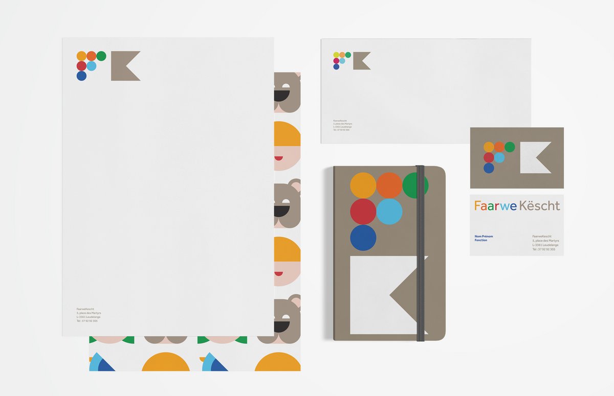
Planning and opening a new school building is not an everyday occurrence. For this special occasion, the municipality of Leudelange has trusted us with designing the brand identity for ‘Faarwekëscht’. The new primary school which includes a Maison Relais.
Challenge
The design of a brand identity of an educational institution is always challenging. In this case, the identity needed to be playful yet modern because the building represents the future of the municipality.
Concept
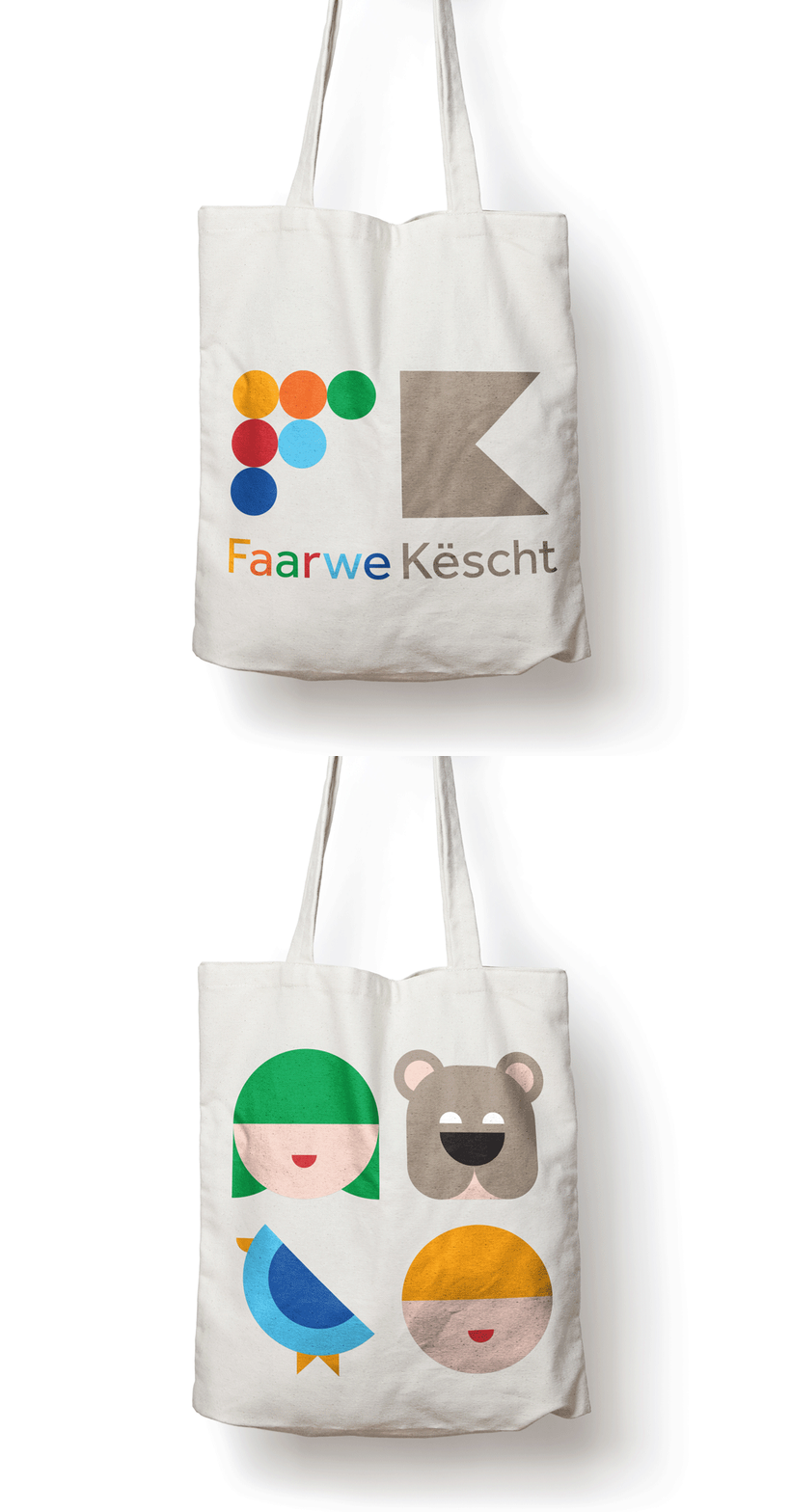
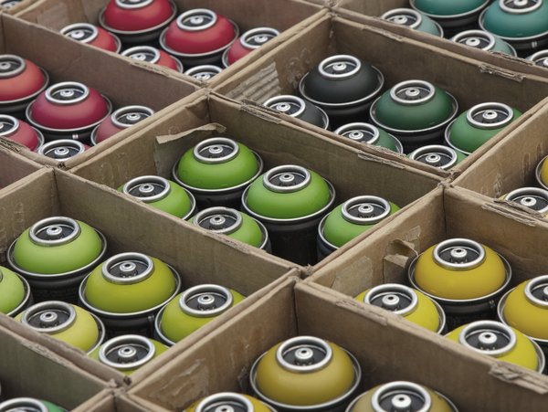
The logo consists of two components which reflect the word 'Faawekëscht' (en.: colour box). The first part of the logo stands for the word 'colour' and the second part stands for the word 'box'. The inspiration emerged from a simple image of a box, filled with spray cans and organised by colour. As a result, we formed an 'F' out of the different coloured dots and formed a 'K' with a folded box.
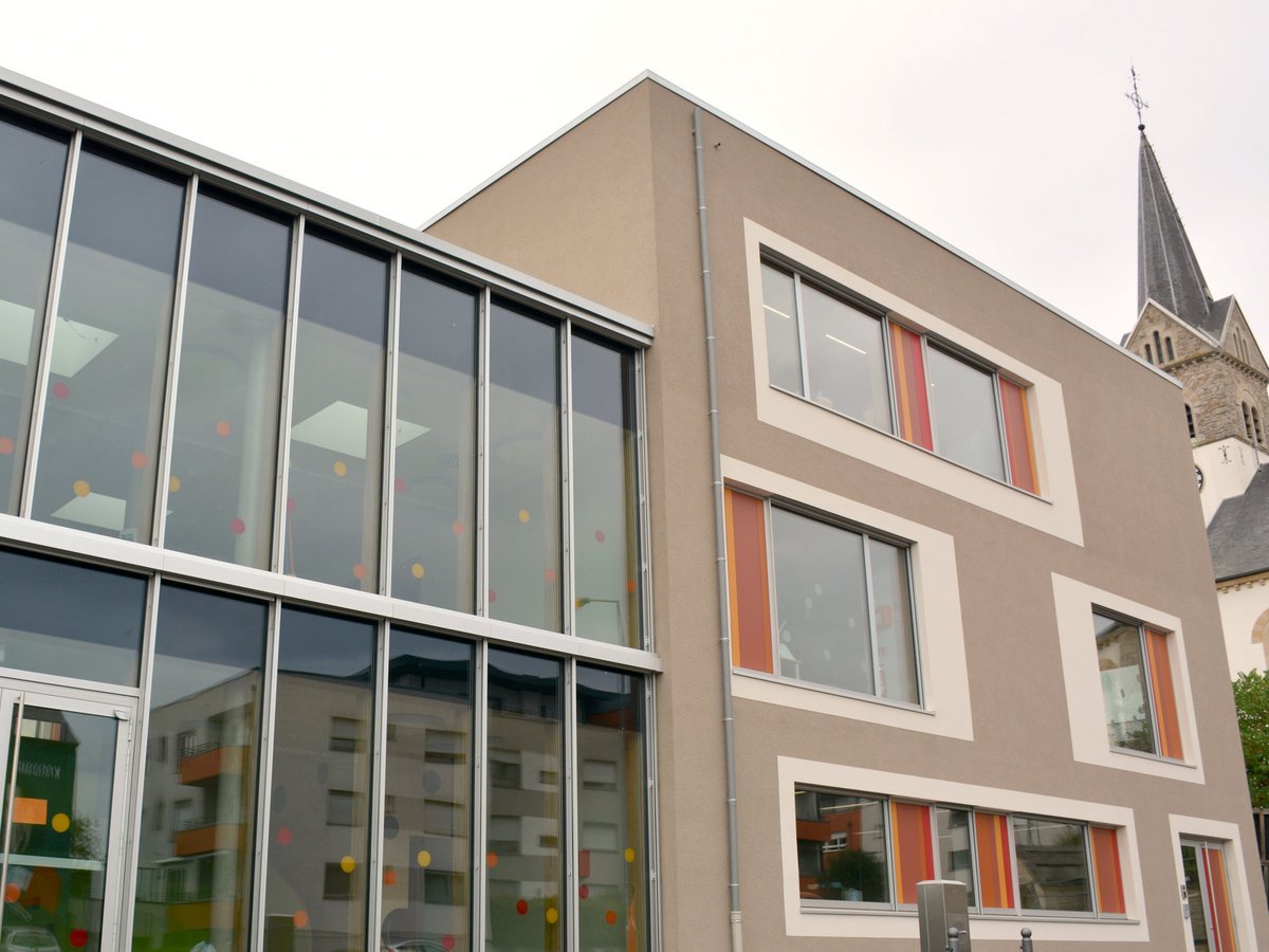
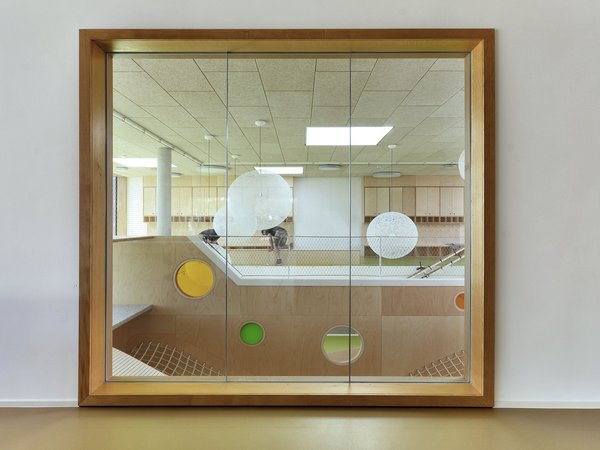
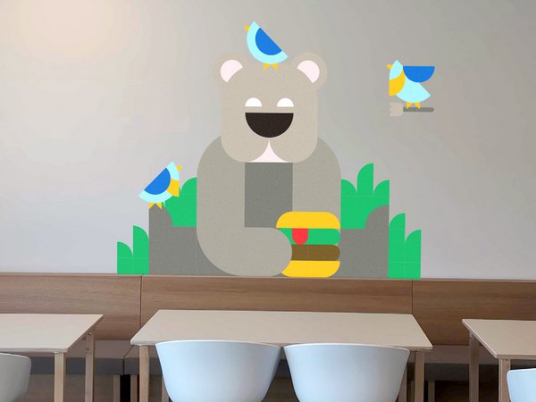
The colours and icons were already present in the ‘Faarwekëscht’ architecture, so to match this playful ambience we applied the colours to the typeface to complete the logo.
The typography should reflect the educational purpose of the ‘Faarwekëscht’. Therefore, we chose to go with Effra, a sans-serif typeface with clean line and humanist shapes.
The entire design reflects the purpose of the building complex ‘Faarwekëscht’, which is to promote the harmonious development of the children in an educational and social environment.
