Commune de Leudelange · New corporate identity for Leudelange
Challenge
Cities in Luxembourg are usually very attached to their coat of arms. So to embrace change we needed to find a noteworthy symbol that would represent Leudelange’s ambition. More generally, a strong brand concept that would work on every digital medium as well as on more traditional ones to fulfil the needs of a municipal administration.
Brief
If you know a little bit about Luxembourg you know that Leudelange is on the rise. To make it a statement, the city of Leudelange asked us to develop a brand new corporate identity. The most important aspect to keep in mind: reflect the ambition of a fast-growing city.
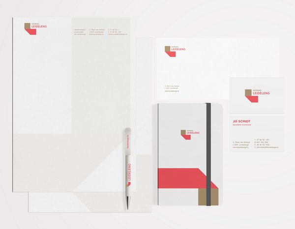
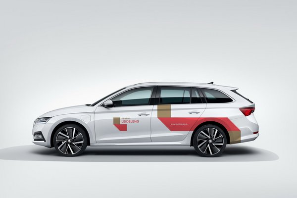
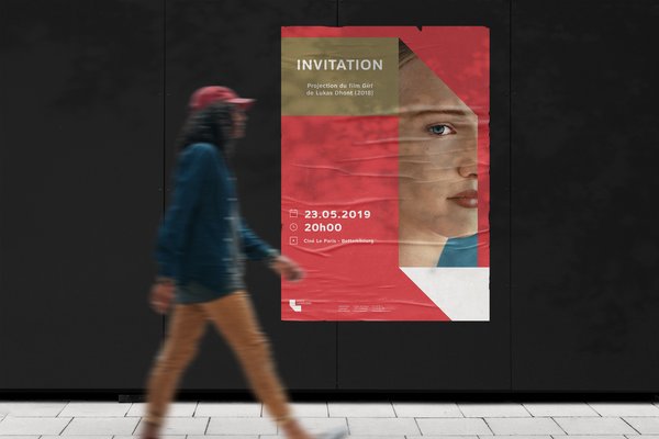
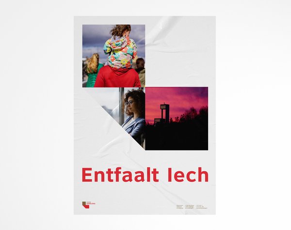
Solution
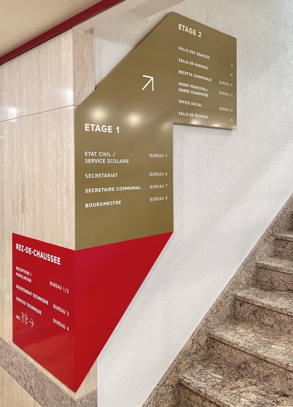
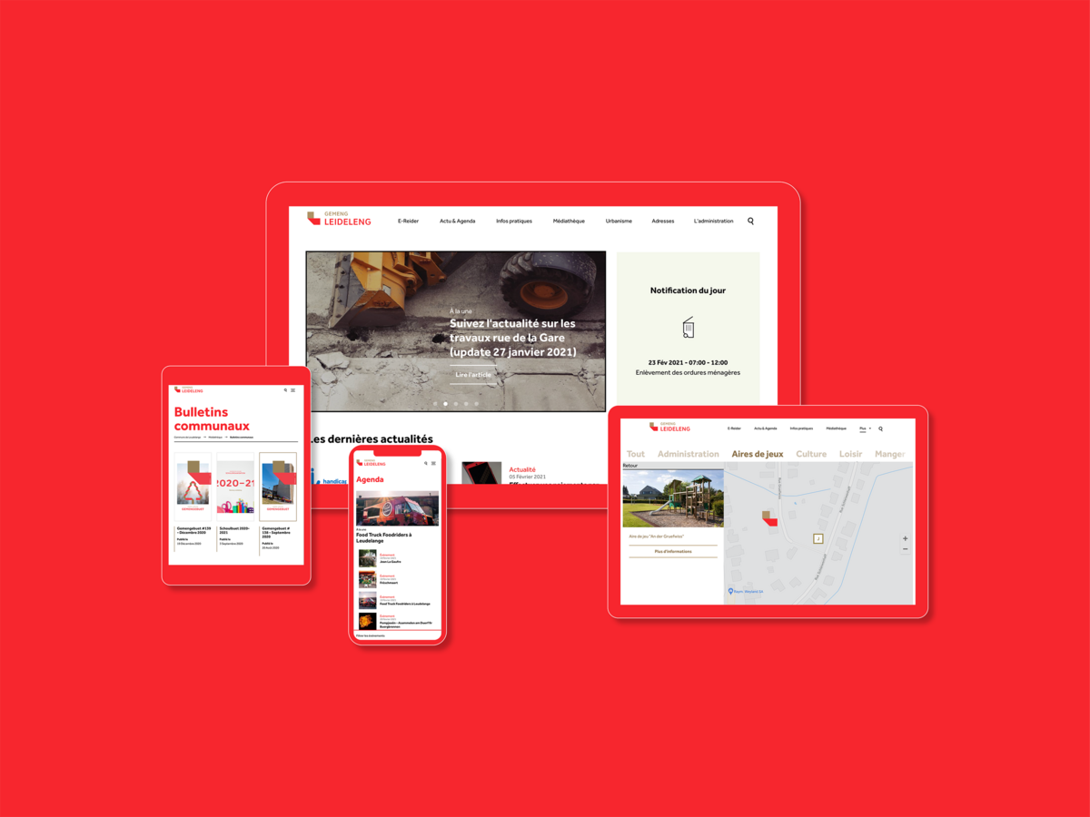
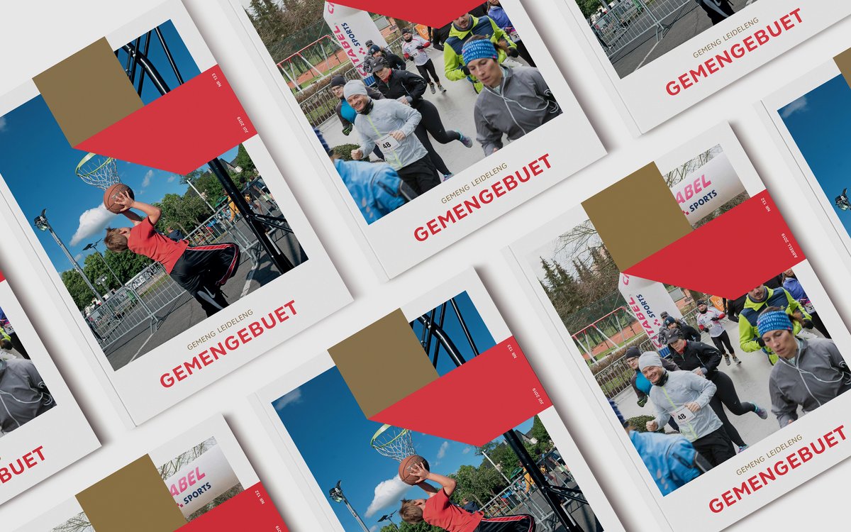
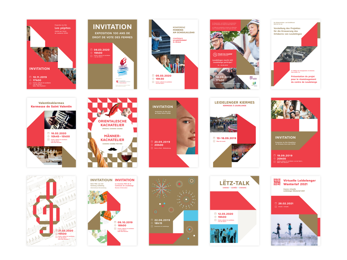
An infinite and scalable graphic system. Folded into an "L" (L for Leudelange), this ribbon develops, connects and combines with textual, graphic and photographic elements in an infinite and evolutive way.