Service de Coordination de la Recherche et de l'Innovation pédagogiques et technologiques (SCRIPT) · Branding and User experience of Heydoo
We were commissioned by SCRIPT (Service de coordination de la recherche et de l’innovation pédagogiques et technologiques), a committee from the Luxembourg Ministry of Education, to think and design the first educative resources platform in Luxembourg. A platform to promote their large range of educative resources and make them available to the public in one single place.
Challenge
Working on this project raised several challenges.
From a User Experience perspective:
Identify and define the main audience segments,
Gather and organize the existing resources in relevant groups and subgroups of content,
Build a navigation system that fits multiple browsing scenarios,
Create a set of template pages that are optimized for search engine indexation but also easy to browse by the website’s users.
But also from a Branding perspective:
Find a brand name that stands out and conveys meaning,
Create a visual system that inspires the playful aspect of learning and respects the formal position of SCRIPT in Luxembourg,
Give personality to the brand without getting the upper hand over the unique character and style of each educational resource.
Solution
Branding and visual identity
Heydoo’s branding is based on 4 key foundations:
Brand Name
Logo & typography
Color palette
Assets
Name
Heydoo comes from an abbreviation of the word “Education”. It is similar to how you would pronounce “Edu” in English, German, Luxembourgish, and also French but with a Luxembourgish accent.
The name is like an interjection that conveys support through appeal. In fact, you can’t but pronounce the name with dynamism, the intention is to send motivation and strength. The concept of interjection is also declined with different messages that encourage you to learn as much through your successes as your failures.
“Yay! I made it!”
“Hey! look at you genius!”
“Bravo! that’s correct!”
“Ta-ta! Here it is!”
“Uh-oh… let’s try again!”
“Hmm… interesting though!”
Logo & typography
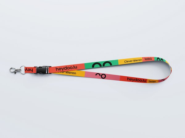
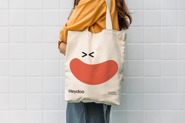
The logo is pretty formal to balance the other cheerful brand attributes like the colors and the assets. It’s a simple logotype in full black (or full white) using the typography VisbyCF. Only a slight animation brings playfulness to the logo in very specific contexts. When the logo is used as the foreground element or on interaction events, we animate its “eyes” to add a tiny bit of complicity and proximity.

Color palette
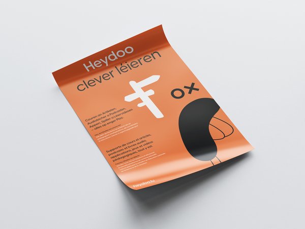
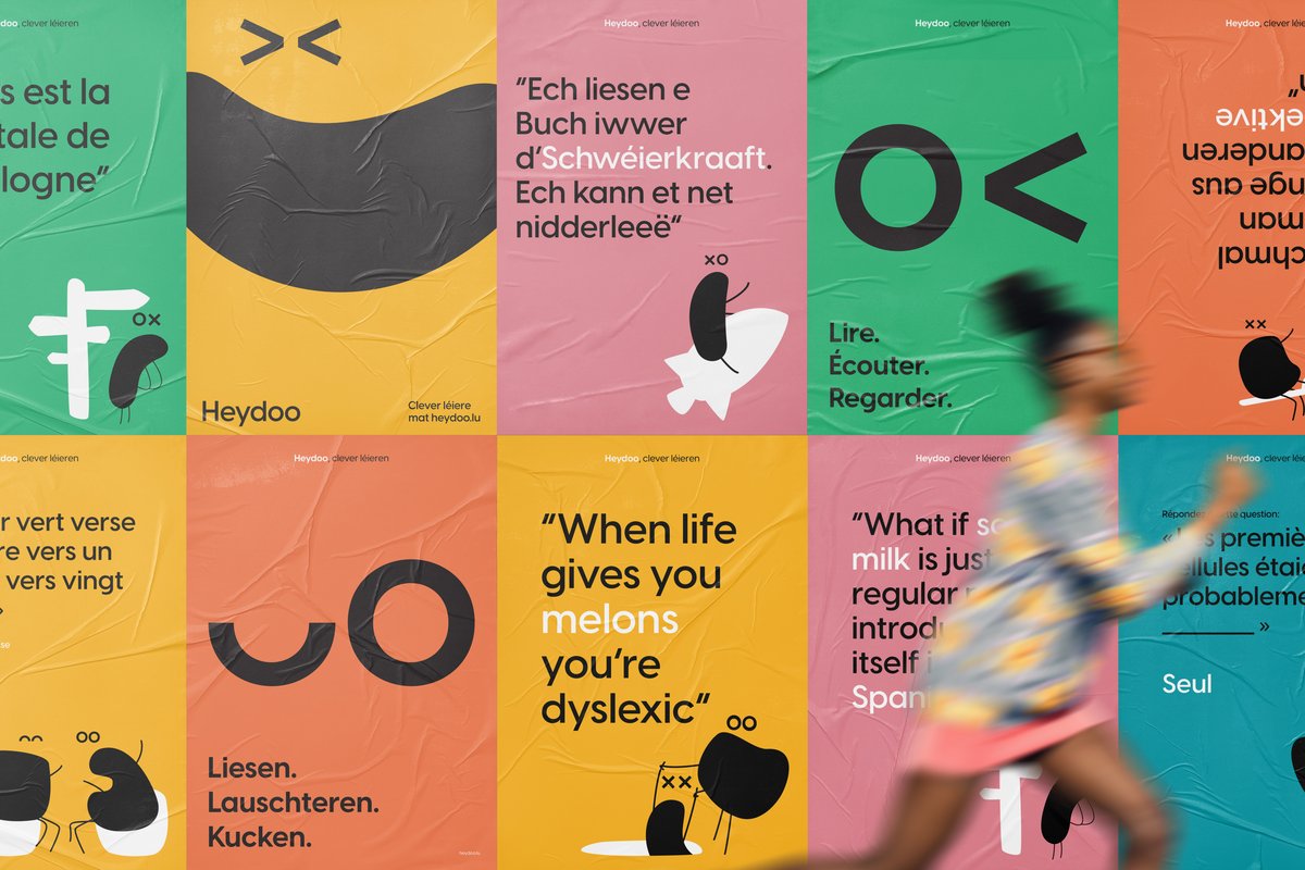
The color palette is the strongest attribute of the Heydoo brand. The colors are vibrant and playful to help convey what Heydoo intends to bring to the educational ecosystem. The colors are used for pictograms but also applied on large flat tint backgrounds to make the content stand out.
Assets
The brand identity is extended with a set of custom assets that have specific purposes:
Icons: for a utilitarian usage across the interface (actions and basic informative clues)
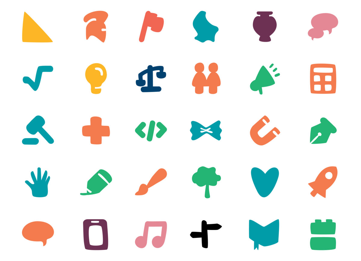
Pictograms: to represent keywords like a subject, a theme, or a school level
Illustrations: to represent more complex concepts or ideas and convey meaning through storytelling
User Experience
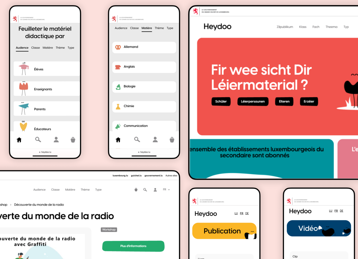
On a platform that curates and gathers such a variety of resources, many browsing user experiences must coexist. To support these experiences we designed a main navigation that suggests key ways to discover and browse through all the educative resources available on the platform.
From this navigation, users can browse resources by Audience, School Level, Subject, Theme, and Type of resources.
Each navigation entry has its own grouping structure. Some are one level deep like Audience, Subject, and Theme. Others are two level deep like School Level and Resource Type.
The navigation menus are completed with Hub pages that make browsing a content segment more comfy and enjoyable. Hub pages offer great landing pages for people googling thematic educative resources keywords or wishing to dig into a specific set of content from the website. The Hub page template promotes resource previews grouped by recency and popularity but also lists all the resource sub-groups or associated resource formats that users can use to refine their research.
From there, the user can either visit the detail page of a resource or get redirected to the browsing page with the relevant filters automatically activated.
