Schroeder & Associés · Website design, branding and visual identity
Brief
Revamping Schroeder & Associés S.A.’s visual identity. The engineering office wants to visually represent and transmit their vision: building a sustainable world by acting responsibly.
Challenge
Creating a modern visual identity that stands out, while preserving the strong 60 years of engineering experience of Schroeder & Associés S.A. We had to combine traditional and modern elements, a really tough cookie.
Including Schroeder’s 2030 strategy: sustainability at the center of its philosophy and future projects.
Solution
Branding
Schroeder has accumulated numerous visual representations in its past: We considered as many as possible while creating the new visual identity - one that truly reflects its know-how and values.
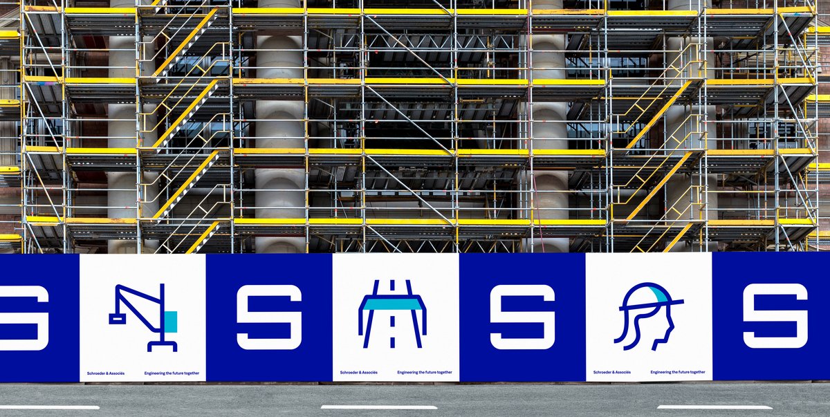
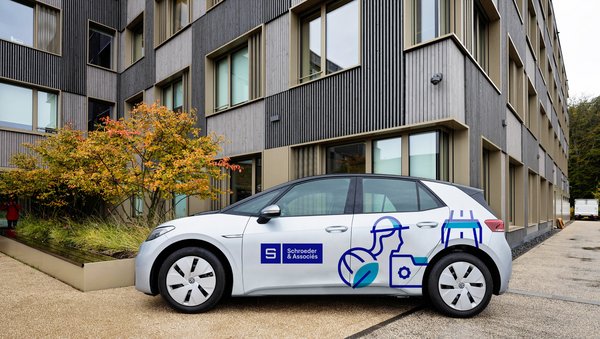
In line with Schroeder’s engineering culture, we used a “construction grid” for the graphic elements. The entire content produced in the Schroeder universe follows that grid: visuals, texts, animations, and more. The grid itself follows modern trends, it’s flexible, spaced and bright: a perfect fit for Schroeder’s future-oriented work ethic.
The Logo
The same grid was used as a base for the new Schroeder logo. The traditional “S” saw some subtle, yet refreshing changes, and the main blue color has been turned slightly brighter (Pantone 72C). This gives the logo a modern and elegant touch. The new “Schroeder blue” is accentuated by a brighter midtone (Pantone 312) giving the whole visual identity a modern and light touch.
The Font
Martin Vácha’s “Denim” was used for small texts and large titles. The font is quite sober and straight, which expresses a technical aspect. Schroeder’s engineering universe can thus be found in the chosen font, while still maintaining a human touch. The result: A font that mirrors Schroeder’s efforts to combine modern engineering with human values.
Visual Identity
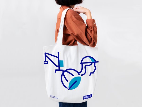
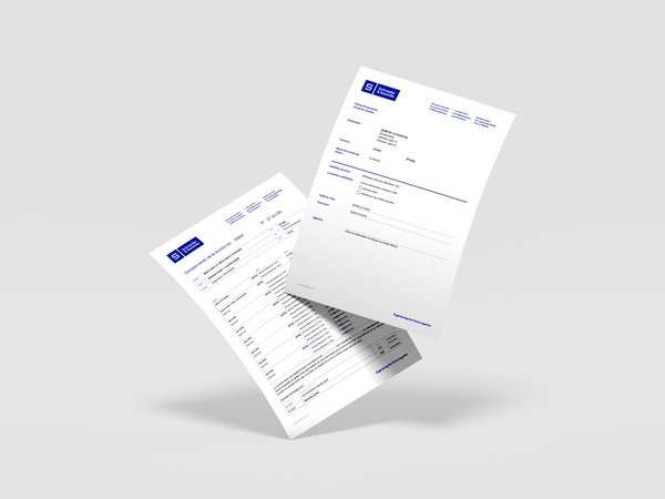
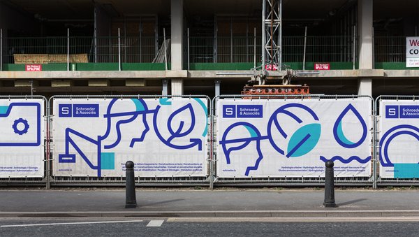
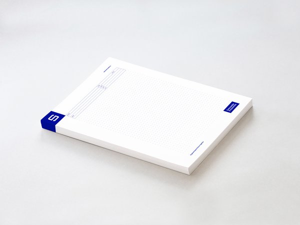
Based on these first changes to the brand identity, various other objects and elements have been updated: business cards, construction site banners, car paint jobs and official documents.
The goal was to keep the new visual identity consistent throughout the company’s documents, objects and gadgets. It was designed to look convincing and strong on paper, on the terrain, and on the internet.

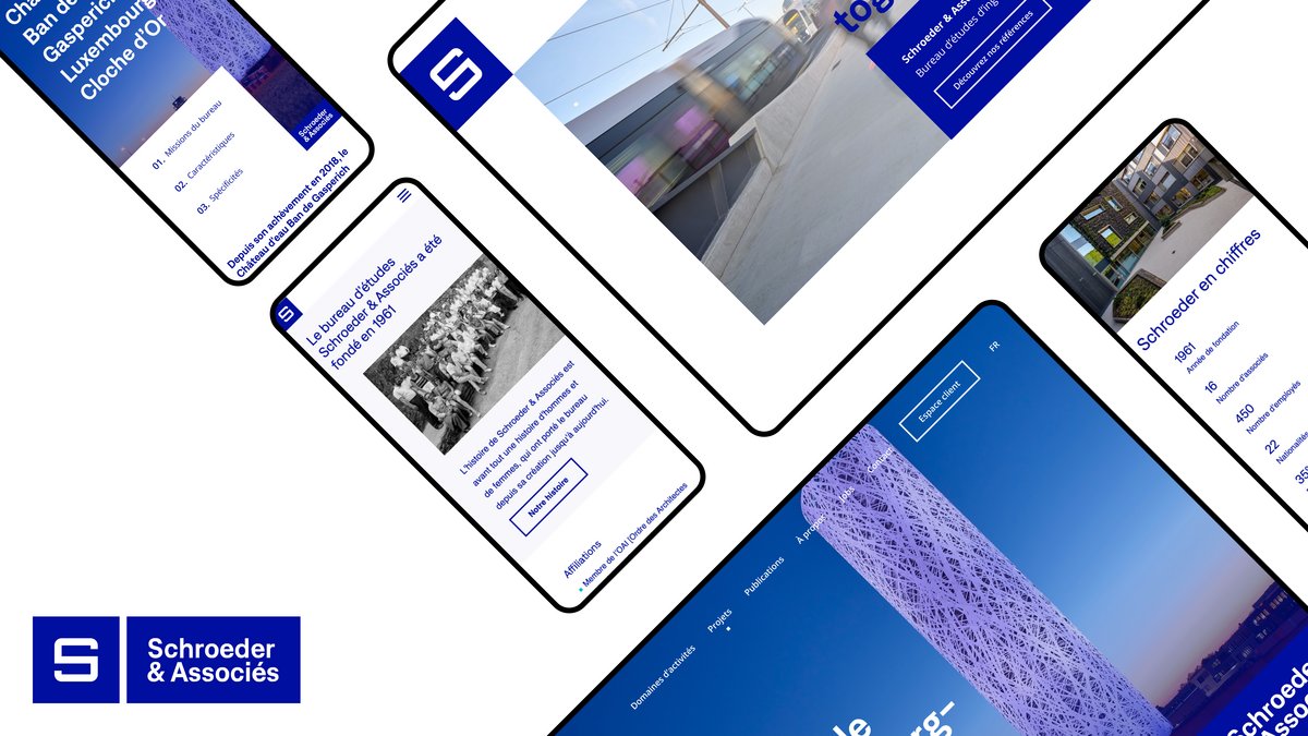
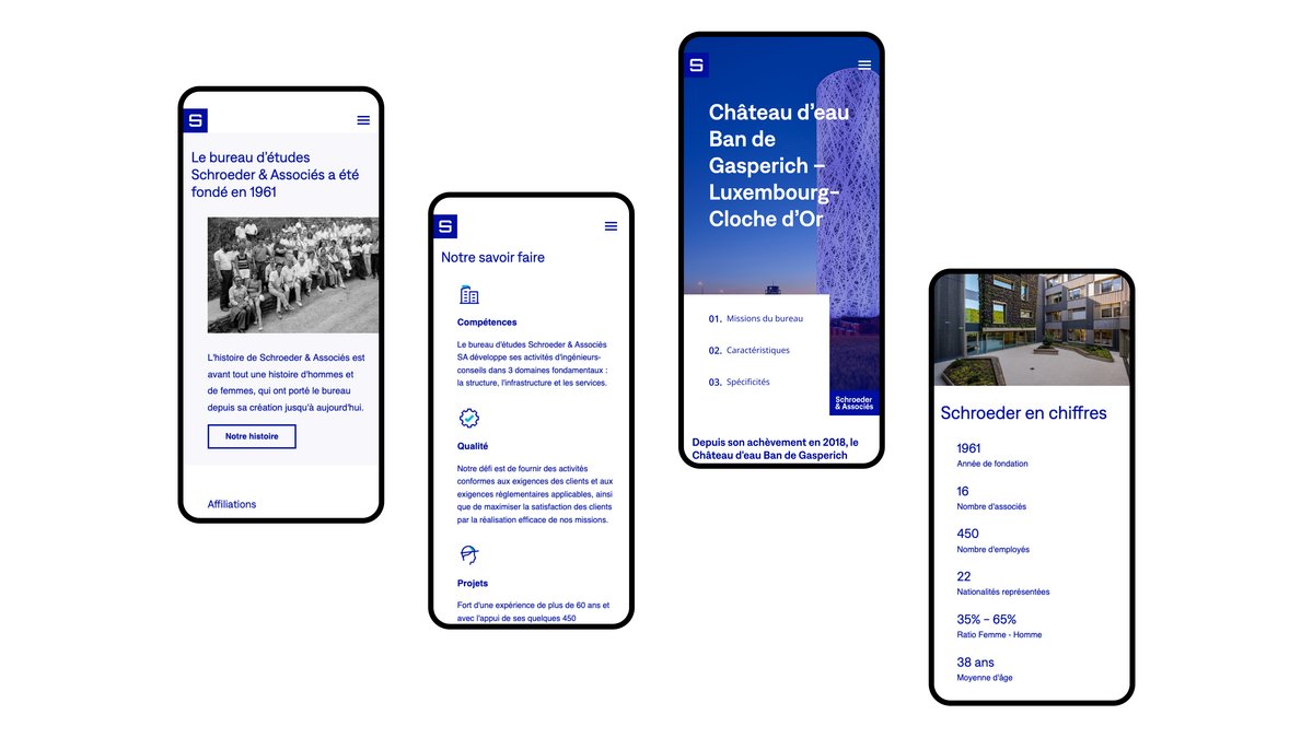
The website
The final component of Schroeder’s new branding is the website: A grid serves as a baseline for the different elements to create modern and interesting designs. The goal was to highlight Schroeder’s activities: we wanted to make their project references stand out as much as possible. The company’s commitments in terms of durability and sustainability were also taken into account. The entire website is tied together by clean and modern touches and a set of custom pictograms.