Oesling · New Brand Identity for Oesling

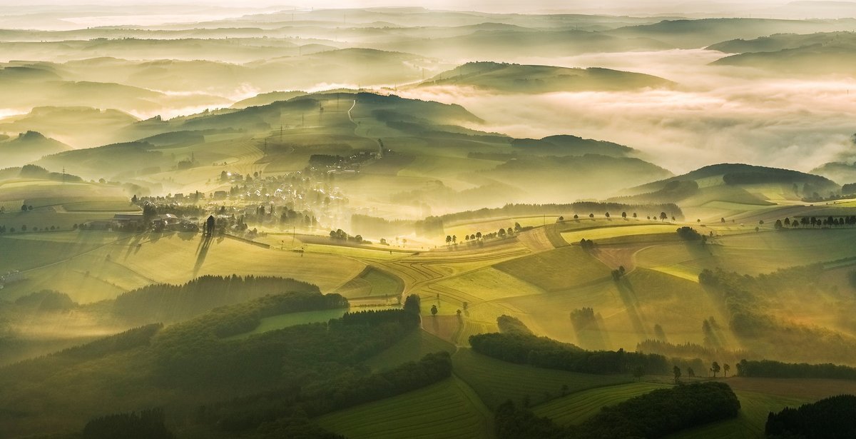
Although Luxembourg is a small country, there are many treasures scattered all over it. The most scenic ones hidden up north, in the Éislek, or Oesling. When Oesling, a real estate portal, came to us in 2020 to repolish their brand identity, we knew it would be a wonderful project.

Challenge
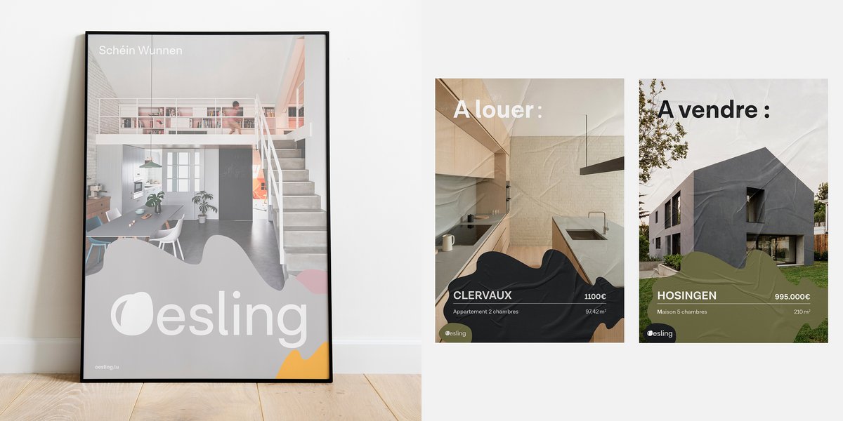
This new brand identity represents what the Oesling stands for: nature, panoramic scenery and greenery. It should also entice people to consider investing in property up north. For this, Oesling wanted to bring forth quality over quantity and promote a better living environment: “Schéin Wunnen”.
Concept
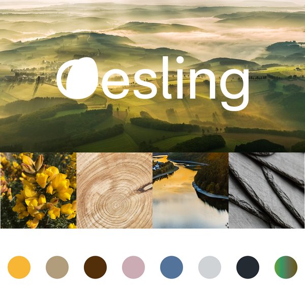
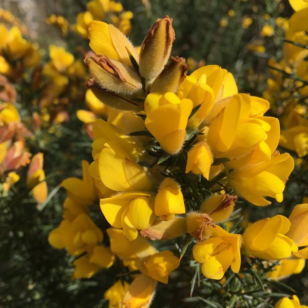
To mirror the aspect of nature and a better living environment, we decided to use a seed for the “O” of Oesling. With this seed grows the Oesling’s heritage, hence it stands for a continually increasing value of the quality of life and the investment in property in the Oesling. This also becomes clear when considering that oak trees stand for strength, longevity and protection. Furthermore, they are a keystone species, keeping forests healthy. This theme of nature is also reflected through the chosen colour palettes, inspired by the Oesling’s vivid landscapes. They consist of greens, browns, yellow, blue, grey and a dusty lavender.They adapt throughout the seasons with nature itself.
For the typography, we chose a highly versatile, yet discretionary typeface with a lot of visual character. The typeface Lota Grotesque ensures that Oesling can stand out of the crowd.
This design consolidates the meaning of “Schéin Wunnen” (living beautifully) where the quality of the property as well as life in general is meant. “Schéin Wunnen” therefore becomes more than a selling point for beautiful real estate. It becomes a lifestyle, where living in the Oesling means living alongside nature, in a better environment.