Just in time for the 2026 edition of the yearly Autofestival, we launched a new visual concept for Spuerkeess’ leasing concept Lease Plus that aims to appeal to a wider audience thanks to its dynamic layout composition and richer colour palette.
Together with Neon Internet, we created a music video to accompany a rap song for CMCM, a health mutual in Luxembourg. The already existing rap song was produced in collaboration with Gast Waltzing and Culture The Kid and is highlighting the mutual’s services and why becoming a member is the best choice for people looking to get additional health coverage. We combined our forces with neon internet – design excellence meets AI genius, to create a video that was completely generated by AI. The result is a fun and lighthearted video with hiphop influences that perfectly showcases CMCM’s unique selling points.
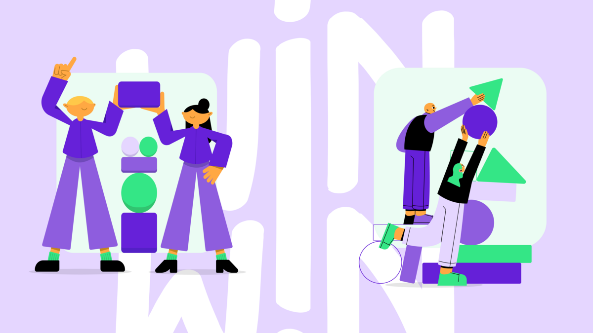
Together with 42 Luxembourg, we encourage people from all different backgrounds to dive into the universe of coding and join the free coding school in Belval to become the developers of tomorrow. This fun recruitment campaign aims to entice people to sign up for 42 Luxembourg’s coding boot camp, commonly known as “Piscine”, with engaging visuals and striking copy. In order to make potential developers familiar with the “Piscine”, we reimagined the tools that are essential to one’s coding journey, such as the computer and the keyboard, as pool inflatables.
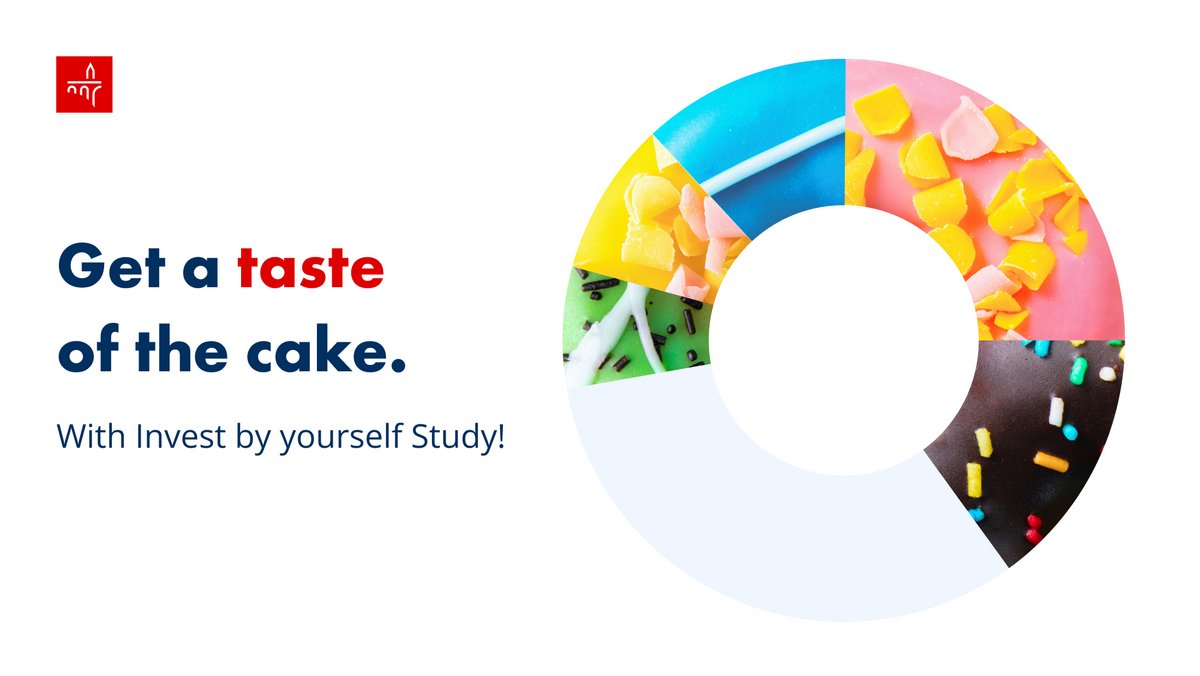
Investing just got sweeter! For Spuerkeess' latest investment product, Invest by Yourself, we reimagined market share in the shape of cake slices. The result: An accessible campaign that targets different age ranges with mouthwatering visuals and straight to the point copy.
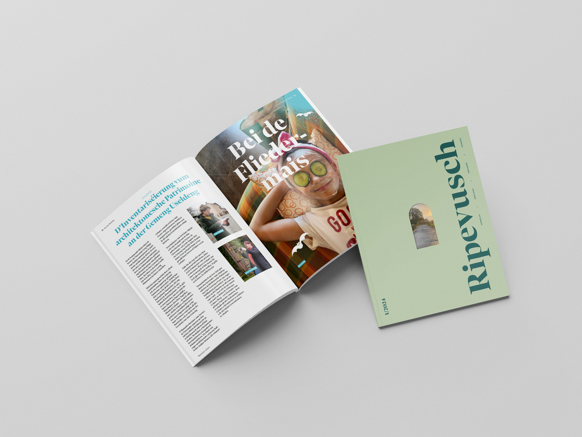
Commune d’Useldange, one of our oldest clients, publishes their very own magazine thrice a year. The magazine was in need of a revamp and we were asked to take care of it. The result is a contemporary design with a fresh and inviting layout.
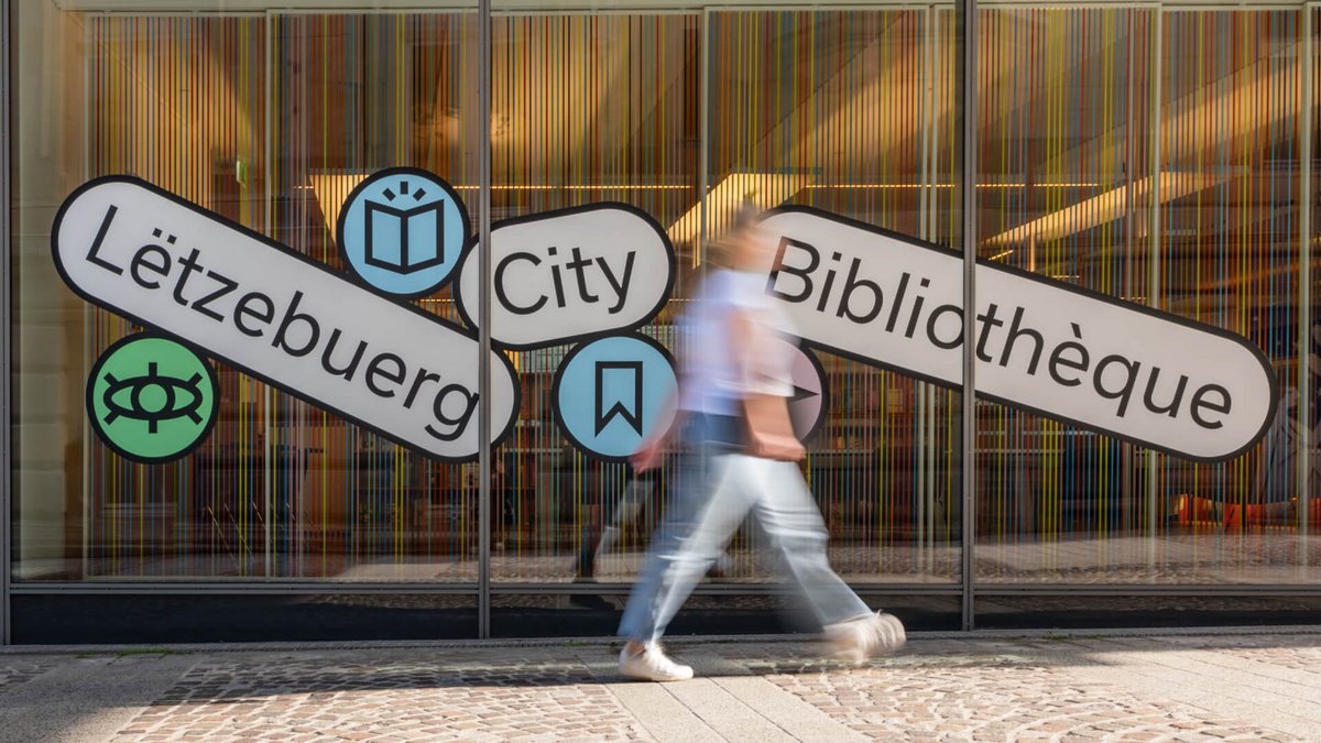
Tech meets tradition! We created a fun, visual logo in tag format inspired by the way librarians categorise books and the way people browse the web. The result: A modern and versatile logo with a high recognition value!
A website redesign and updates to all documents to create a unified brand experience. The central motive is the logo's line, which is versatile and can be used across all channels.
We completed a series of motion design videos introducing Talkwalker's new AI solutions. These videos effectively communicate complex information, improving user understanding in an easy-to-digest format.