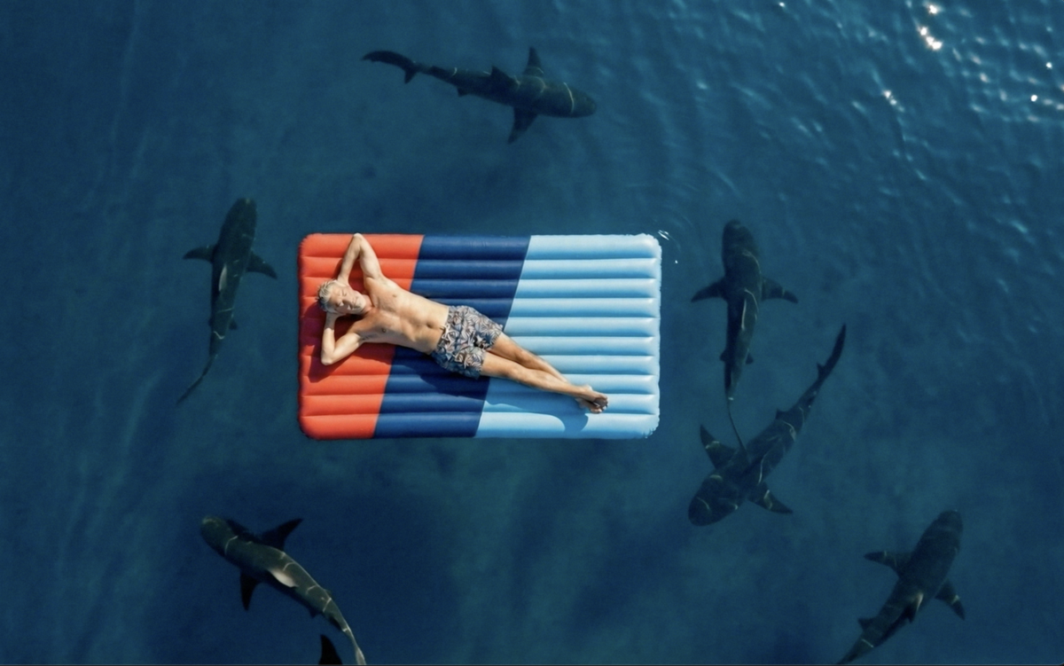
This site uses cookies. By using the apart website you are agreeing with our Cookie Policy.
Logo & branding for Manon Bock, personal fitness coach. The logo shows the Initials of Manon Bock and reflects the workout repetitions, heart rate, performance and progress curves in an elemental monochrome new logo.
A vivacious and colourful campaign to introduce parents, teachers and students to the first platform of educational contents in Luxembourg. A project led by SCRIPT, a committee of the Ministry of National Education, Children and Youth.
Since its launch in 1982, the Bicherbus service has been continuously reinvented, improved and redesigned. In 2021, we gave the Bicherbus a new look that literally conveys the concept of the service: a library on wheels.
Logo & landing page design for the new investment initiative Project Rise founded by Patrick Kersten, Christophe Folschette & Thibaut Britz.
Powerhaus handles all types of electrical installations. The name and the logo perfectly represent the main activities of Powerhaus. The power button and the house are illustrating the company name.
Spuerkeess' Mobile Onboarding makes opening a current account online a breeze. With the slogan: "Check this out" along with an illustration of a surfer, breaking the waves on credit/debit cards and money, the message was clear: it is such a hassle-free process, anyone can do it, anytime, anywhere.
Architecture and design are never just black and white and this becomes clear on Fabeck Architectes' website, when the project's true colours only reveal themselves when you hover over or visit their detail pages.A website constructed from minimalist building blocks, displaying only necessary information.
Ciné Scala is unlike any other movie theatre/cinema. You're always welcomed by a warm family vibe and comfort! Revisiting their brand identity was as satisfying as watching a movie with a nice popcorn cone. Sweet or salty, your choice :)
S-Net Newscenter is now more pleasant with extensive use of the illustration style we developed for Spuerkeess.
Zeyen Baumann's corporate identity has become as multidisciplinary and utilitarian as its team. The shapes are more than patterns. They transform into cartography and topography designs, revealing the office's field of activity and experience.
We created an App Icon System, for both external and internal Spuerkeess applications. This system ensures that all icons have a unified look and feel to them and are all based off the original Spuerkeess logo, making them a simple yet significant part of the brand image.
We refreshed Lucien Schweitzer's brand identity and website, combining tradition with modernity & creation with realisation.
For Luxaviation new visual identity, we linked distinction and discretion with an "x", representing LuXaviation, LuXembourg and the luXury of travelling in a private jet.
Beton Weber, a long established company that nevertheless keeps up with times. The new corporate identity reflects the two core values: Tradition & Quality
Discover our brand identity and website for Utopian Future Technologies.