Laboratoires Réunis · Laboratoires Réunis: Website revamp

Brief
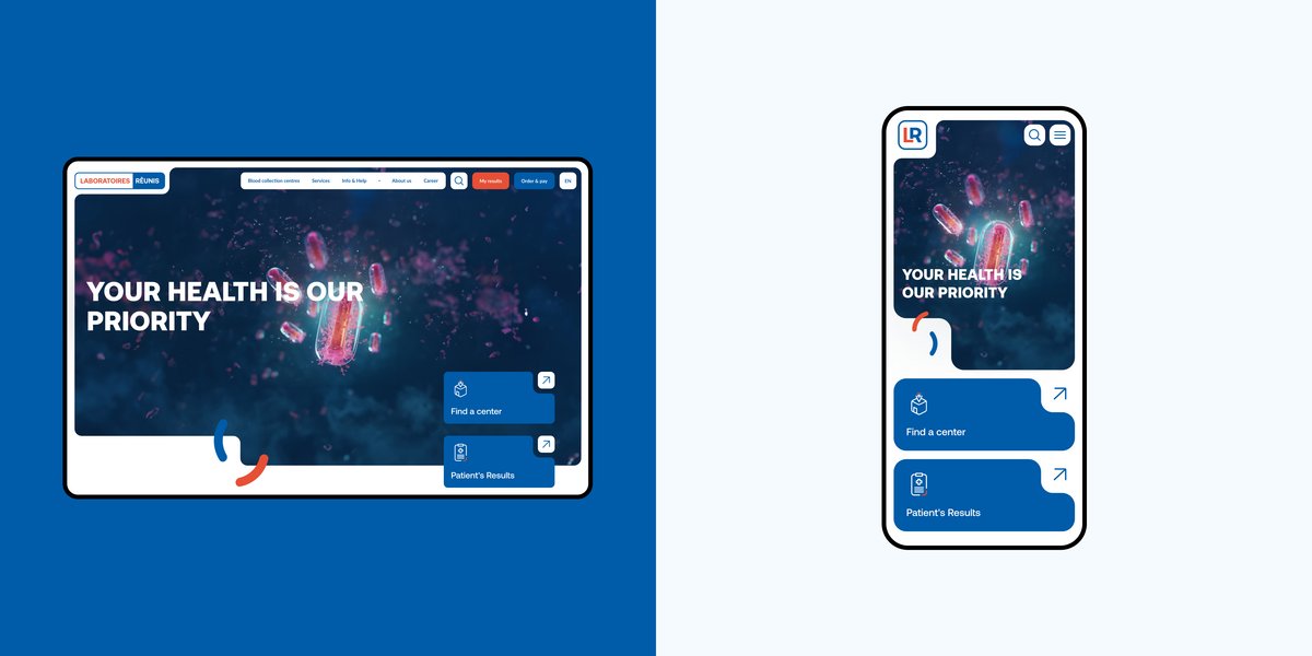
Luxembourg's Laboratoires Réunis had a clear vision: a website that reflected their values of excellence and transparency, while delivering a design consistent with the established brand guidelines by the agency WildSolutions. Say no more, we were up for the challenge!
Challenges
We faced a few challenges along the way:
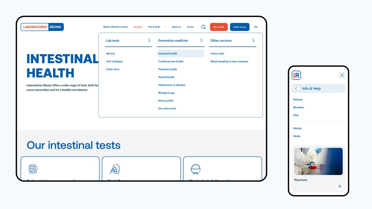
- Simplify the user experience despite the large number of services and tests available in an easy and concise way.
- Meet the brand guidelines already established by WildSolutions and develop a digital counterpart.
- Highlight Laboratoires Réunis’ core values.
- Combine different styles and creative ideas all together.

Solution
We prioritized clarity and visual appeal, creating a clean, user-centric design that demonstrates Laboratoires Réunis' commitment to excellence. This definitely played a role in the user-friendly navigation we achieved, and brought greater design flexibility.
Navigation
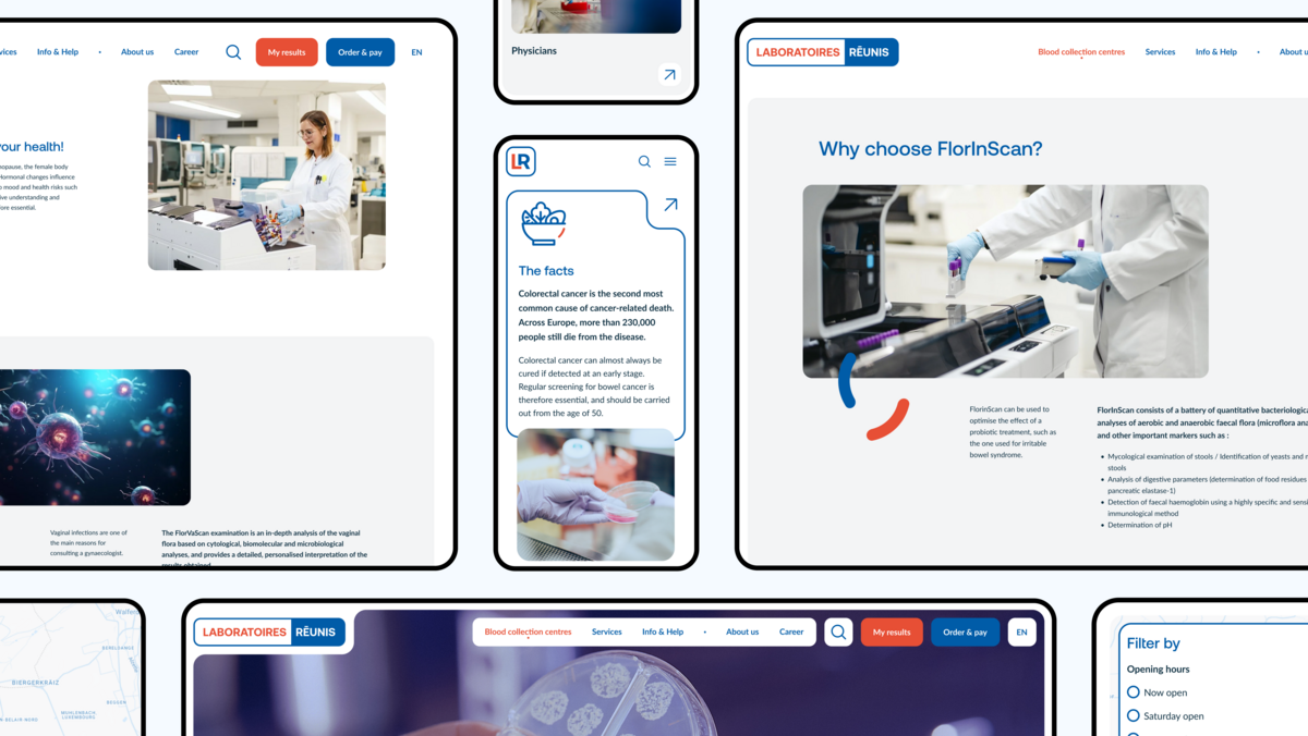
This user-centric approach guides users clearly to the most important content and actions on the website. It also adapts easily to different devices and screen sizes, making it consistent. The card border is a key element of the website; you'll see it on almost every element, and it gives a fresh, modern look to Laboratoires Réunis' online presence.

Icons and Illustrations
Another important task on this project was the design of a rather extensive list of icons for each test analysis and for the different parts of the website. We started with a central element, the rounded red border of the logo, which served as the basis for the design of the icons. As for the illustration, we wanted something more unique, while trying to ensure that we could integrate it into our website design and on other corporate publications.
Back-end development
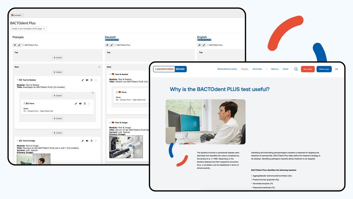
On the technical side, the website's back-end is managed using TYPO3 CMS, drawing on our extensive expertise with the CMS. TYPO3 offers advantages that we always appreciated, such as extensive customization, secure development, multilingual implementation and scalability.

Conclusion
By collaborating with WildSolution, we delivered a website that met Laboratoires Réunis' expectations. The minimalist design not only fits in with the existing guidelines, but also results in a modern and user-friendly experience.
